


"*" indicates required fields
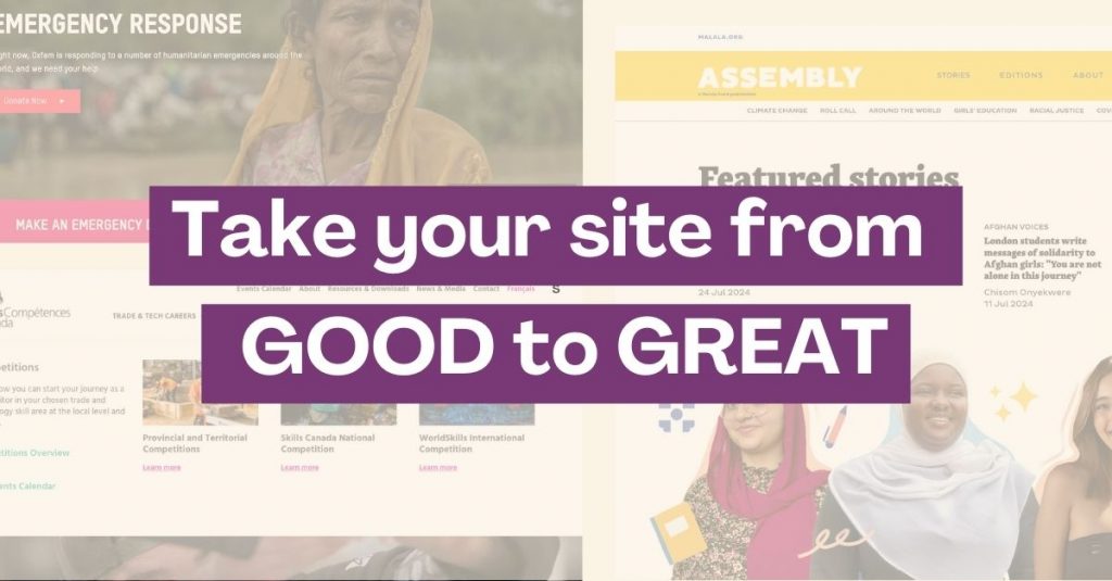
8 Essential features every non-profit website should have
Creating an effective non-profit website goes far beyond just providing information; it’s about building meaningful connections with your audience. A well-designed website serves as a vital tool for non-profits to engage donors, volunteers, and supporters by communicating their mission clearly, showcasing impact, simplifying the donation process, and fostering inclusivity.
In this article, we explore key features every non-profit website should include—from crafting a compelling mission statement and sharing success stories to optimizing donation pages and ensuring accessibility for all users.
These features not only help increase trust and transparency but also encourage long-term relationships that are critical to your organization’s success.
Key Takeaways:
- A well-placed, well-written mission statement ensures users can quickly understand your purpose and decide if it resonates with them
- Focus on improving your website’s navigation, mobile responsiveness and loading times to ensure a user-friendly experience
- Showcasing testimonials, success stories, or case studies gives visitors confidence that their time or money will be well-spent
- Ensure your donation page is optimized not only for accepting payments, but for building trust with your audience
- Appeal to potential volunteers by optimizing your website with prominent calls to action and a simple sign-up process
- Use post types to manage your events efficiently and create a landing page to showcase upcoming events
- Make it easy for users to join your social media community by featuring prominent links, share buttons, and integrated feeds
- Take the time to learn, understand and implement the basics of web accessibility so that all users can interact with your website efficiently
1. Communicate your purpose with a clear mission statement
When visitors arrive on your home page, it’s your chance to make a strong first impression. The content at the top of your home page should be able to convey who you are and what you do within seconds.
This is where having a strong, clear mission statement (paired with compelling visuals) comes into play. Visitors should feel an immediate connection to your cause once they see this content.
How to write a strong mission statement
Crafting a clear mission statement involves a few key steps. First, you can brainstorm and write bullet points based on these prompts:
- Why does your organization exist?
- What problem are you solving or addressing?
- Who are you solving these problems for?
- What specific impact are you making with your work?
- Who are you or who are the people who make up your team?
Use your brainstorming notes to move on to the next step: writing draft statements. While writing, keep these tips in mind:
- Avoid long, complex sentences. A mission statement should be concise so visitors can quickly understand your purpose.
- Highlight the change or result your organization seeks to achieve and be as specific as possible.
- Avoid jargon and technical terms that might confuse your audience – write the statement for someone who knows nothing about you.
- Make your statement easy to remember and repeat. This helps both your team and supporters communicate it effectively to others.
- Ensure your statement aligns with your brand and organizational values.
Formulas to follow:
“Our mission is to [what your organization does] by [how you achieve this] in order to [the impact you aim to create].”
“We are [who you are] working to [problem you solve] for [who you work with].”
Client example
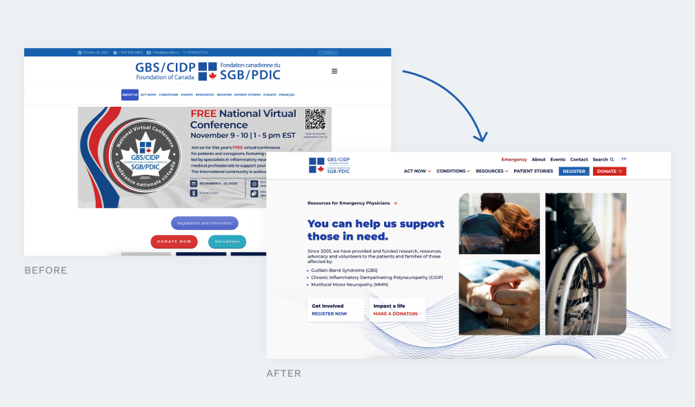
For the GBS-CIDP foundation of Canada (new website launching in 2025), our team crafted a hero section that appeals to the user’s emotions and immediately gives a high level understanding of what this organization does. When paired with fresh photography, the result is a first impression that really makes an impact.
More mission statement examples:
- World Wildlife Fund: “World Wildlife Fund Canada is the country’s largest international conservation organization. Guided by the best scientific analysis and Indigenous knowledge, we work to conserve species at risk, protect threatened habitats, and address climate change. Our long-term vision is simple: to create a world where nature and people thrive”
- Charity: Water: “We’re on a mission to bring clean water to the 703 million people living without it. You can join us. No matter how much you give, every cent funds clean water projects around the world.”
- Last but not least – us at U7 Solutions: “We help non-profits thrive online with custom websites and marketing solutions.”
2. User-friendly design
Creating a user-friendly website is key to keeping visitors engaged and helping them easily find the information they need. For non-profits, this means making it simple for users to navigate your website and get involved in your community without frustration.
Here are 3 core elements to focus on to immediately boost the UX (user experience) of your site:
1. Clear and intuitive navigation
Simple, well-organized navigation is critical to a positive user experience. Visitors should be able to find the information they’re looking for with minimal effort, without feeling overwhelmed or lost.
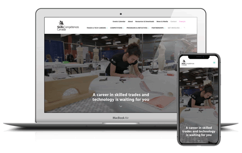
For more complex websites with many pages or programs, like Skills Canada, consider using a mega menu—a larger dropdown that can display more pages than a standard menu. This helps users quickly locate what they’re looking for, minimizing confusion and making the overall experience smoother.
Navigation design tips:
- If using a standard menu (not a mega menu), include only the essential links to avoid overwhelming users
- Make sure the key pages you want visitors to see (like donate, volunteer or events) are prominent and can be accessed in 1-2 clicks
- Review your website’s analytics to identify the most visited pages – this tells you which pages are appealing to your users. Consider making these pages more easily accessible via the main menu (if it makes sense to do so)
- If creating a mega menu, use design elements like columns and subheadings to keep links organized
- Consider including images or icons to add visual interest – as long as they don’t impede the user experience
- Use clear, descriptive labels for each section so users know exactly what they’re clicking on.
Boost your online presence with our help
- Web design and development
- SEO and PPC
- Social media strategy
- AI technology
2. Mobile responsiveness
With the majority of users now accessing websites from mobile devices, it is essential that your website functions well on all screen sizes, and your team should dedicate time to thoroughly testing this.
A responsive design ensures your website adapts seamlessly to different screen sizes. Common pitfalls of a non-responsive design include unusable navigation, links that are too small to click, and wide content that flows off the page. These issues lead to frustration and high bounce rates (users leaving your site).
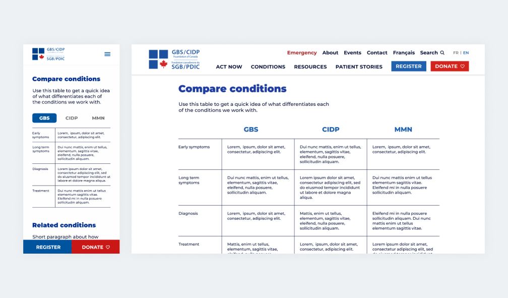
The next time you create a new page or section for your site, consider using the mobile-first approach. When our team worked on new designs for the GBS-CIDP Foundation of Canada website (launching in 2025) we used a mobile-first approach by mocking up the pages on mobile before desktop. This helped us flag potential usability issues early on. For example, we knew the clients wanted a table on the “conditions” page, but this does not work well on a narrow mobile screen. Considering this issue early on led us to develop an alternate layout for mobile using tabs to replace the table columns.
3. Fast loading times
If your site takes too long to load, users are likely to leave before they even see your content. Fast loading times are particularly important for mobile users and can directly impact your bounce rates and overall user experience.
To make sure your site is up to speed (pun intended) use Google’s free tool: PageSpeed Insights. It provides detailed insights and suggestions for improving your site’s performance, helping you optimize load times to keep visitors engaged.
How to improve loading speed:
- Compress images to reduce file size without sacrificing quality
- Minimize the use of heavy scripts or plugins that slow down your site
- Ask your web provider/maintenance team (like U7!) for recommendations to improve site speed, e.g. server optimizations or faster hosting
3. Show real results with success stories
When people visit your website, they are likely asking, “Does this organization actually make a difference?”
Show them that you do by weaving impact stories throughout your website. Testimonials, case studies, and real-world examples are the most effective way to prove your impact and show tangible results.
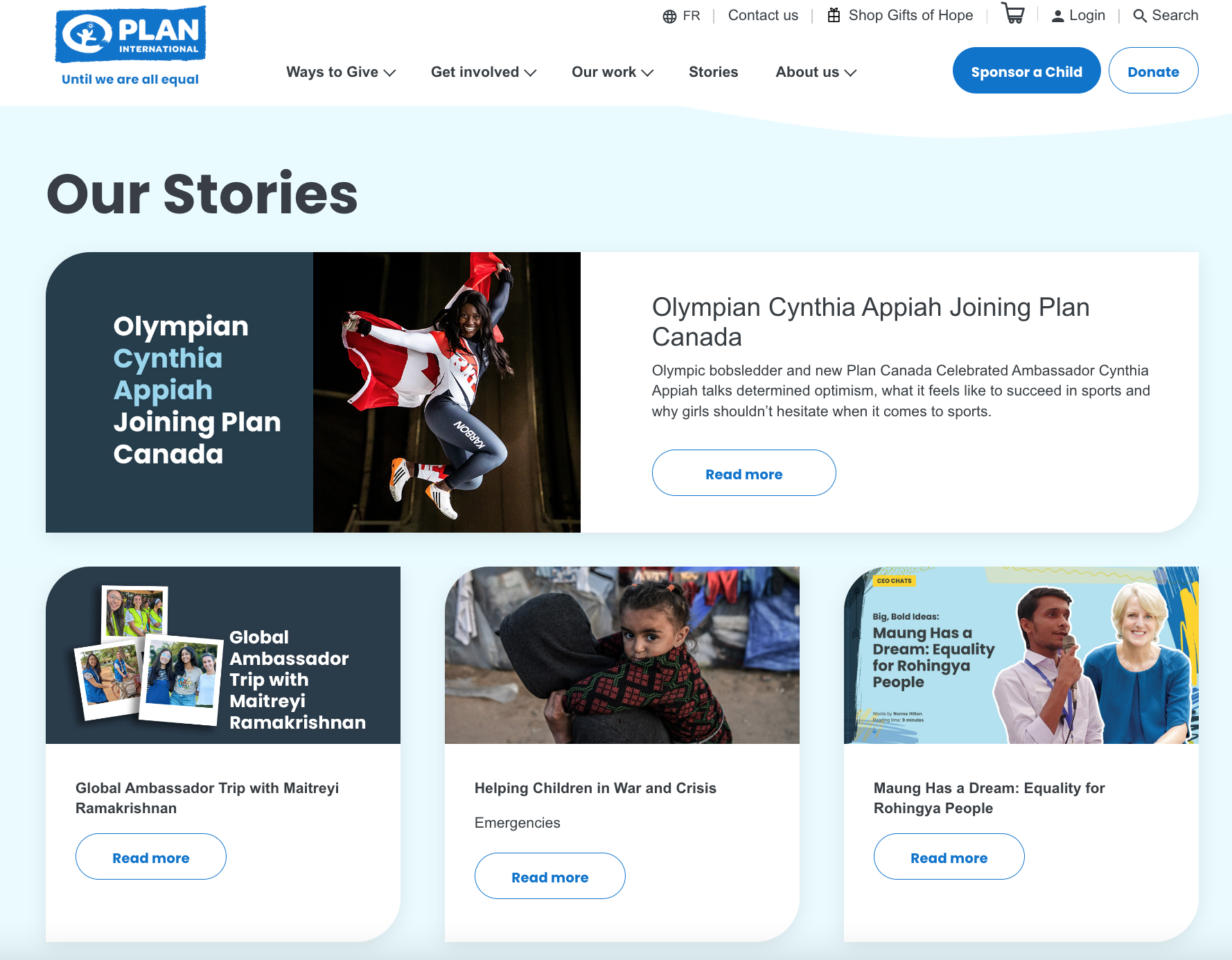
For example, charity: water displays testimonials and success stories not only on their “Our Work” page but also across their blog and donation sections. World Wildlife Fund highlights success stories and statistics on their homepage and throughout various campaigns. Plan International’s homepage encourages visitors to explore stories about how their mission positively influences the communities they serve.
How to incorporate success stories into your website
- Sprinkle written or video testimonials across several pages like your home, donation, event, and volunteer sign-up pages.
- Dedicate a blog category specifically for sharing success stories
- Use a testimonials slider to highlight quotes from people who have benefitted from your work. This slider can appear on several different pages.
4. Make giving easy with a dedicated donation page
One of the most critical elements of many non-profit websites is the donation page. To encourage visitors to give, it’s essential to make the process seamless and trustworthy. At the core, most people give because they trust your organization and believe in your cause.
However, trust extends beyond just your mission—it includes confidence in the online tool itself and transparency around where the money will go.
How to optimize your donation page
Feature a prominent donation button in your menu to make the donation process accessible from every page. The easier it is to find and click, the more likely donors are to follow through.
Showcase testimonials and success stories to build trust with potential donors by demonstrating how previous contributions have made a real difference.
Offer secure and recognizable payment options like credit cards and PayPal to ease concerns about online transactions. Include trust badges, SSL certification, and clear messaging about your secure process to boost donor confidence.
Highlight how donations are allocated by including text that states where the funds will go, whether to specific programs or general operational costs. This transparency reassures donors that their money is being used effectively.
Provide recurring donation options to secure long-term support. Offering monthly or annual donations gives donors the convenience of automatically contributing and making a continuous impact.
5. Engage your community with a volunteer sign-up page or section
Volunteers are the backbone of many non-profits, and your website plays a key role in making it easy for them to get involved.. Here’s how to optimize your volunteer recruitment with your website features.
Streamline the sign-up process
Place your volunteer sign-up button prominently in your menu, so it can be accessed from every page. Keep the sign-up form simple and intuitive, asking for only the most essential information like name and contact details. Remember that every additional field you add is potentially deterring users from completing the form.
Create a dedicated volunteer landing page
While a sign-up form or section on your website might seem sufficient, a dedicated landing page for volunteer sign-ups offers a far better experience and engagement potential.
By dedicating a full page to volunteer recruitment, you have space to share your story, using testimonials, photos, and even videos to inspire visitors to take action. This level of storytelling helps potential volunteers clearly understand how their involvement makes a difference. You can also include features like the benefits of volunteering or a dedicated calendar/events section that highlights volunteer opportunities.
Additionally, landing pages are easier to promote. You can share a direct link to this page across social media, in newsletters, and in advertising campaigns, making it simple for individuals to sign up without having to navigate through your entire site.
Appeal to your volunteer’s motivations
What drives individuals to volunteer? Understanding these motivations can help shape your content and copywriting. Common motivations include:
- Many volunteers want to contribute their time and skills to make a positive impact.
- Some individuals volunteer to gain experience or learn new skills.
- Volunteering offers a chance to meet like-minded individuals and build community.
- Many are motivated by the sense of purpose and personal satisfaction from making a difference.
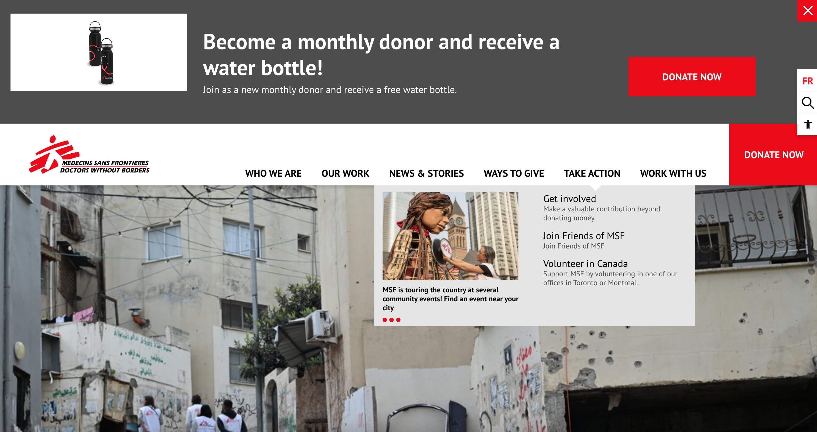
Keep these motivations in mind when you write copy for your volunteer forms, landing pages or calls to action. For example, the Doctors Without Borders menu tugs at the heartstrings of potential volunteers with strong statements like: “Make a valuable contribution beyond donating money.”
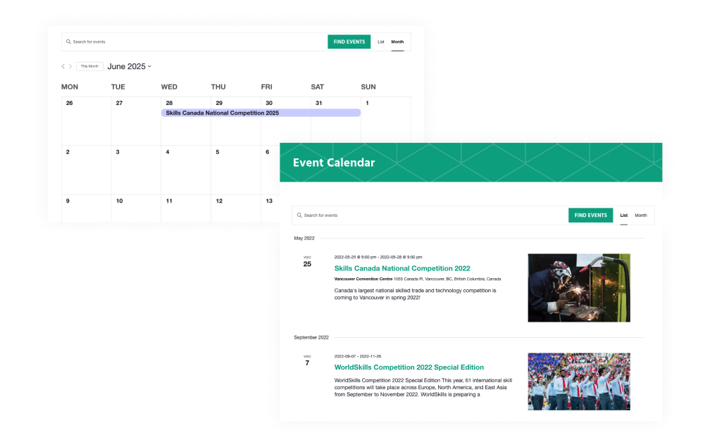
6. Use post types for seamless event management
Managing events efficiently on your website is essential for driving attendance and engagement, and using post types in your content management system (CMS) makes this process much smoother. Say goodbye to manually updating event details across multiple pages on your website!
Why use event post types?
- Consistency and efficiency: Post types allow you to create standardized event templates that include key details like date, location, and registration links. This consistency makes it easy for visitors to navigate and understand each event.
- Automatic sorting and filtering: Event post types can automatically sort events by date and display them in lists or calendars. Whether you want to feature upcoming events on your homepage or direct visitors to a dedicated event landing page, post types help you keep everything organized without manual updates.
- Easy event registration: Make registering for events straightforward by embedding a simple, intuitive registration form directly on each event page. This reduces friction and increases the likelihood of sign-ups. Integrating payment options, donation prompts, or confirmations can further streamline the process.
What to include in your event posts
- Event details: Clearly provide the date, time, location (or virtual platform), and any other key information like ticket prices or dress codes.
- Registration form: Keep this simple and mobile-friendly, and ensure it’s easy to find on the page.
- Event description: Briefly explain the purpose and highlights of the event to spark interest.
- Multimedia: Include images or videos to make the event more visually appealing and engaging.
- FAQ section: Address common questions about registration, refunds, accessibility, or other relevant details.
- Calls-to-action (CTAs): Use clear and compelling CTAs like “Register Now” or “Join Us” to encourage immediate sign-ups.
Create a central events landing page
To improve visibility and ease of access, create an events landing page that lists or displays all upcoming events in a calendar format. This centralized hub allows visitors to quickly browse your events, find those that interest them, and register with just a few clicks. Make sure this page is easy to find through your site’s main menu and integrates with your event post types to automatically update as new events are added.
7. Boost your online presence with social media integration
Integrating social media into your website is a powerful way to extend your reach and engage with your audience, making it easy for visitors to follow, share, and interact with your content. Here are four strategies to integrate your social media channels into your website:
1. Easily accessible social media links
Including social media links on your site allows visitors to easily find and follow your accounts on other platforms – improving the likelihood of consistent engagement and long term support.
- Place social media links in prominent areas of your website, such as the header, footer, or close to CTAs (calls-to-action) like donation buttons
- Use the standard icons for each platform so users can quickly identify them
- Make sure links open in a new tab so visitors don’t lose their place on your website
2. Embedded auto-updating feeds
Integrating embedded social media feeds directly on your website keeps your content dynamic and up-to-date, offering visitors a glimpse of your latest posts, events and updates.
- Embed your most used social media channels on your home page or event pages. Displaying multiple feeds on one page can quickly make your website look messy or cluttered – so only highlight the most relevant one for each page.
- Customize the feed to fit your website’s design so it blends seamlessly with your overall aesthetic.
- Make sure this platform continues to be used for important news and upcoming events so your site won’t appear out of date.
3. Add social share links to extend your reach
Enabling visitors to share your content on their own social media profiles helps expand your reach beyond your immediate audience. The more people share your posts, event pages, or success stories, the more exposure your non-profit gets.
- Add social share buttons to your blog posts, event pages, and other shareable content. These buttons allow users to share your content on their own social media pages straight from your website with just a few clicks.
- Include a clear call-to-action encouraging visitors to share. For example, add phrases like “Help us spread the word!” or “Share this story to support our cause.”
- Use images, quotes, or success stories that resonate emotionally and are more likely to be shared.
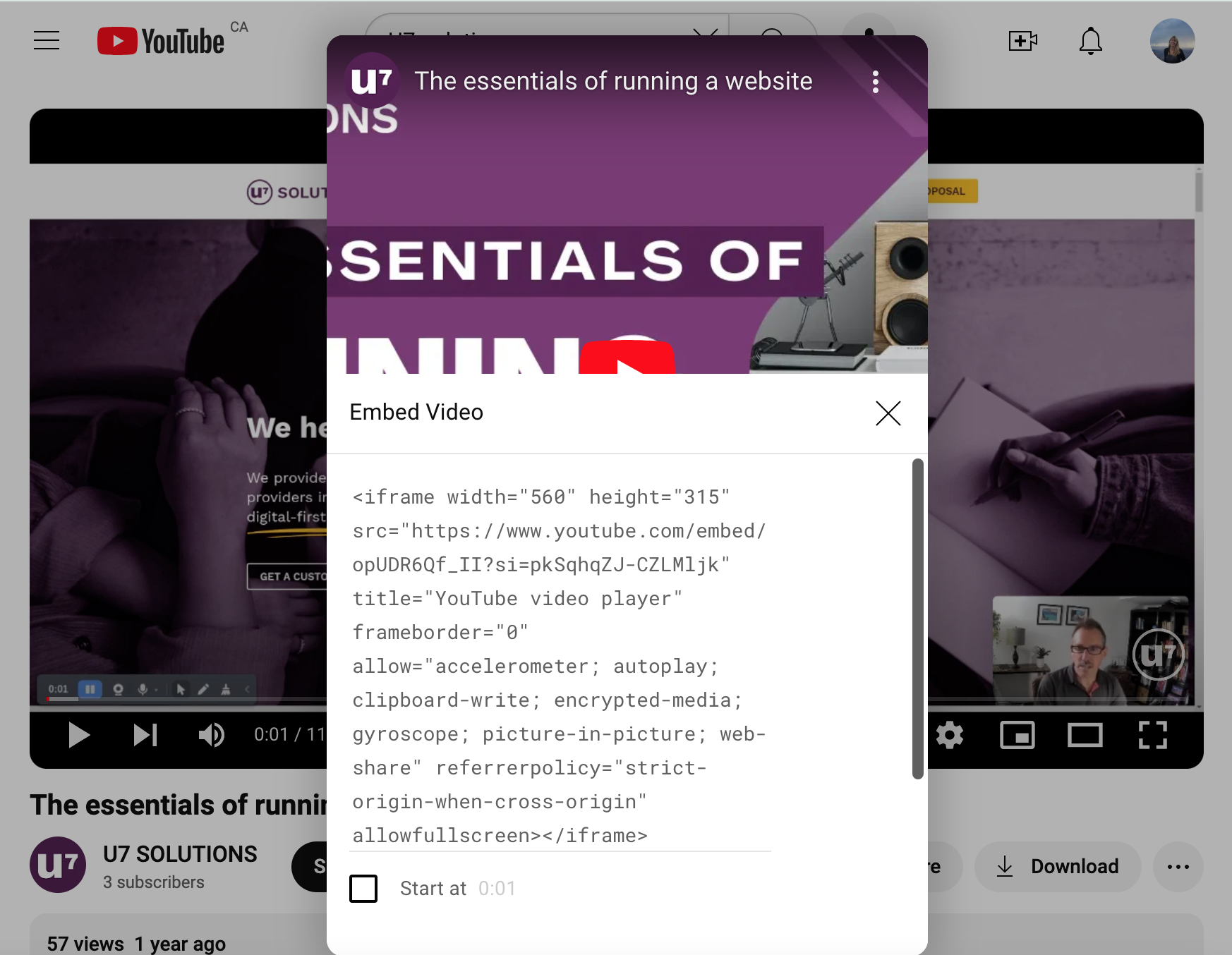
4. Embed videos from YouTube, Instagram, or TikTok
Videos grab attention quickly and can convey your mission more effectively than text alone – in fact, they are consistently proven to be the most engaged with content online. Embedding videos from social media directly onto your website can help illustrate your work, tell compelling stories, or showcase events.
- Embed videos by using the code provided by the platform. You can place them on key pages like the homepage, donation page, or specific campaign pages to enhance engagement.
- When it aligns with the content, like testimonials, use video carousels or galleries to showcase multiple videos in an engaging way.
- Test your site on various devices to make sure the videos work well on all screen sizes.
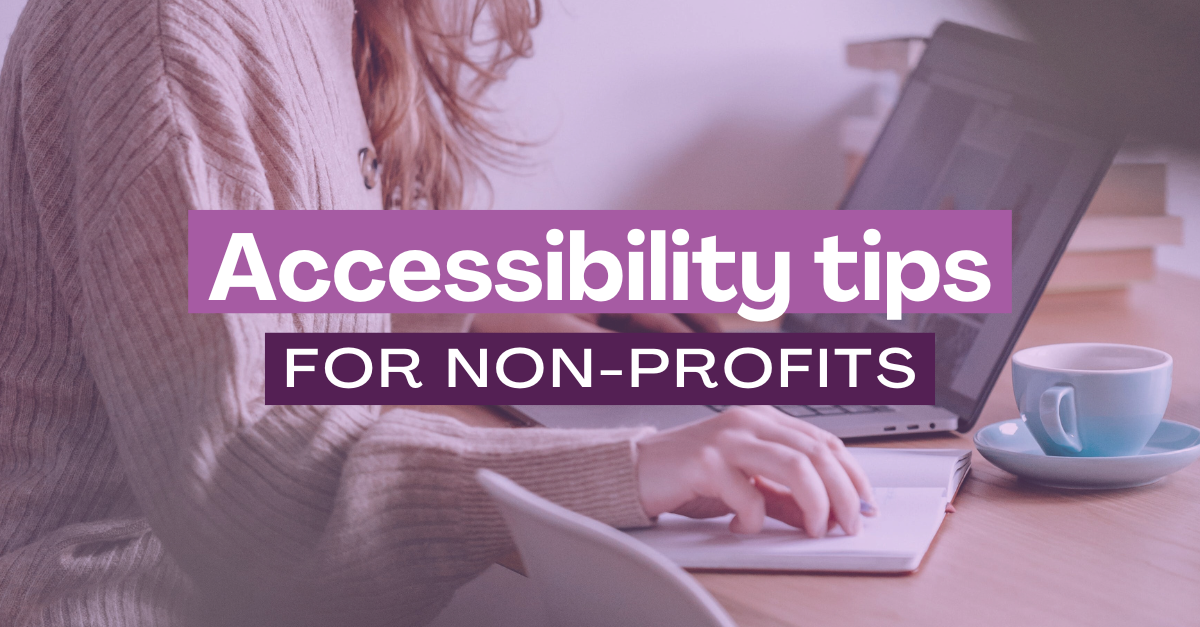
8. Prioritize accessibility
Making your website accessible ensures that everyone, regardless of their abilities, can interact with and engage with your content. Here are just a few key best practices— for more in-depth guidance on improving website accessibility, be sure to check out our recent post.
1. Compliance with accessibility standards (e.g., WCAG 2.0)
The Web Content Accessibility Guidelines (WCAG) set out clear standards to help make websites accessible to individuals with disabilities. By adhering to WCAG 2.0 standards, you ensure that your website is usable for people with visual, auditory, physical, or cognitive impairments.
This means that your website must support features like keyboard navigation, allowing users who cannot use a mouse to move through your site seamlessly. All interactive elements—such as forms, buttons, and links—must be fully accessible to users of varying abilities, ensuring everyone can engage with your site without difficulty.
2. Assistive text for visually or hearing-impaired visitors
Many users depend on tools like screen readers and subtitles to navigate and understand web content. To vastly improve your website accessibility, start by providing descriptive alt text for all images. This text helps visually impaired users who rely on screen readers understand the context of the images on your site. Adding captions or transcripts to video content is vital for hearing-impaired visitors so they can follow along with audio content.
3. Use of legible fonts and colour contrasts
Colour contrast is one of the most important factors to consider for users with low vision or colour blindness. It is crucial that all text and interactive elements have sufficient contrast with their background colour, so that visually impaired users can still see them. You can use tools like the WebAIM contrast checker to make sure your design choices pass accessibility standards.
Poor font selection can also be an accessibility issue. When it comes to typefaces, choose easily legible styles – sans serif is often best for web – and make sure your body copy is a minimum of 16 px.
Create a non-profit website that makes a difference
A well-crafted non-profit website is more than just a digital presence—it’s a powerful platform that drives engagement, builds trust, and facilitates meaningful action.
By incorporating clear communication, user-friendly design, social media integration, and robust accessibility features, you can create an online experience that resonates with your audience and inspires them to support your mission.
Need a hand in bringing your vision to life? Contact U7 Solutions to explore the features that will help lift your organization to the next level. Together, we can build a strategy that will get you closer to your goals.
Related posts

Book a free consult to discuss your goals
Swipe up for expert help!