


"*" indicates required fields
Design and Content Tips for Creating an Accessible Non-profit Website
Ever tried navigating a website, but the text is too small, buttons are out of reach, or videos don’t have captions? Frustrating, right?
Now, imagine someone with a visual impairment or hearing difficulty trying to engage with your non-profit’s mission through that same site. They will likely miss out on vital information and feel excluded from participating in your community.
Here’s the thing: accessibility isn’t just a nice-to-have—it’s essential.
When your non-profit’s website is easy for everyone to use, you’re not just meeting legal standards—you’re making it possible for more people to support your cause.
Let’s walk through some practical, actionable tips to make sure your content is accessible and user-friendly for all.
Why accessibility matters
Imagine an older person with reduced vision and a hand tremor trying to browse your non-profit’s website. They might have difficulty reading small text or clicking on tiny buttons and form fields. Even when they enlarge the text for better visibility, many websites don’t adjust properly, forcing them to scroll horizontally just to read a single sentence.
This not only disrupts the user experience but can also make it nearly impossible for them to complete tasks like signing up for a newsletter or making a donation. These kinds of challenges are why accessibility is crucial.
That’s where WCAG (Web Content Accessibility Guidelines) comes in. WCAG is a set of internationally recognized standards that help make web content accessible to people with various disabilities, including visual, auditory, physical, cognitive, and neurological impairments. These guidelines cover everything from ensuring text is readable and buttons are large enough, to making sure your site works seamlessly with screen readers or can be navigated using only a keyboard.
Incorporating these guidelines isn’t just about functionality—it’s about building trust and fostering a sense of belonging for all visitors.
Improve your site’s accessibility with these tips
1. Use accessible colors
When designing a website, color contrast is one of the most important factors to consider for users with low vision or color blindness.
These users don’t rely on screen readers like blind users might; instead, they depend on sufficient contrast between text and background to be able to read and navigate a site comfortably.
For users with low vision, insufficient contrast can make text difficult to read. For example, light gray text on a white background might be nearly impossible for someone with reduced visual acuity. Similarly, for users with color blindness, certain colors (like red and green) may appear indistinguishable, meaning they can’t differentiate between text and other elements.
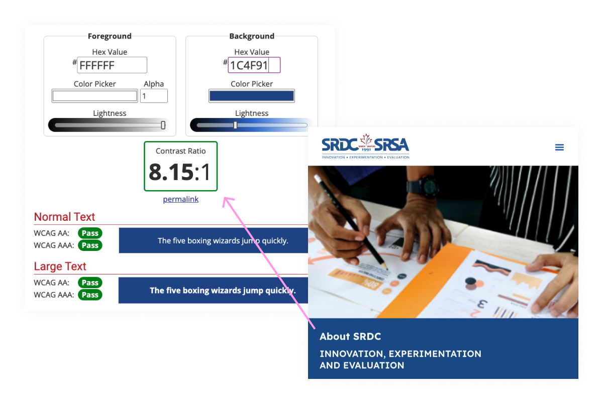
Meeting WCAG colour contrast standards
To ensure your website meets accessibility standards, follow the Web Content Accessibility Guidelines (WCAG), which recommend:
- A contrast ratio of 4.5:1 for normal text (anything under 18pt),
- A contrast ratio of 3:1 for larger text (18pt or larger).
Tools to check color contrast
You can easily check if your color combinations meet accessibility standards using tools like:
- WebAIM Contrast Checker: Input your text and background colors to see if they meet WCAG’s contrast ratios.
- ColorSafe: This tool helps generate accessible color palettes based on your brand’s colors and WCAG guidelines.
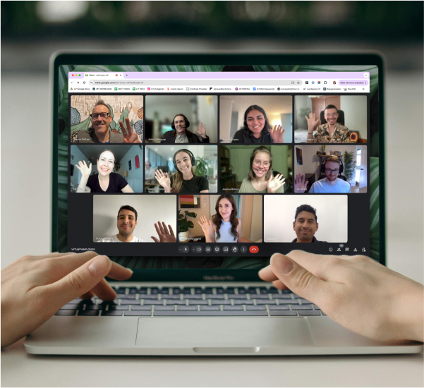
2. Provide accessible video content
Creating accessible video content is essential for ensuring that all users, including those who are deaf or hard of hearing, can fully engage with your non-profit’s mission.
Like everyone else, users with hearing impairments are searching the web for meaningful causes to support, and accessible content makes sure your message reaches them. Below, we cover the importance of providing captions and video transcripts, along with tools and tips to implement them easily.
Auto Captions
Captions ensure that people with limited or no hearing can fully grasp your video content. In fact, captions don’t just benefit those with hearing impairments—users in noisy environments, like on public transportation, or people watching videos without sound (as many mobile users do) will appreciate the option to read along instead of listening.
Adding captions to your videos on social platforms or your website can be simple, thanks to a variety of automatic captioning tools. These tools offer a great starting point, but it’s important to review and refine the captions for accuracy.
Below is a list of some helpful auto-captioning tools:
- YouTube’s auto-caption: A basic tool that generates captions automatically. You can then edit the captions to improve accuracy.
- Instagram’s Accessibility features: Add captions to stories and reels easily within the app.
- Facebook – Auto-generated captions: Facebook automatically generates captions for videos uploaded to the platform, making it simple to ensure your content is accessible.
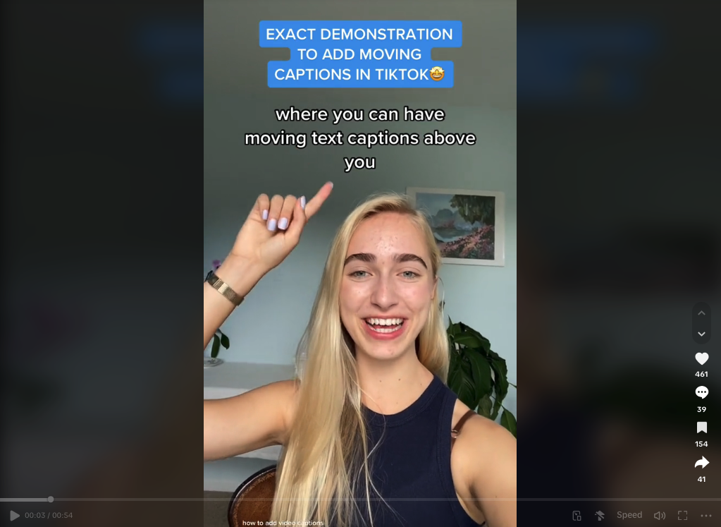
- TikTok Auto Captions: You can activate this feature when uploading videos, and it automatically generates captions, which can be edited for accuracy.
- Rev.com: A professional service offering both AI-generated and human-generated captions with a high degree of accuracy.
💡 Tip: On YouTube, captions don’t appear by default. You may find this video tutorial helpful on how to activate captions.
Best practices for editing auto captions
While automatic captioning tools are convenient, they often require some tweaking to ensure they accurately reflect the audio. Here are some best practices:
- Ensure accuracy: Check for any errors in the generated captions, particularly around names, technical terms, or regional accents.
- Use correct spelling, capitalization, and punctuation: Proper grammar helps maintain the professionalism of your video and makes it easier to follow.
- Include non-verbal sounds: If there are important non-verbal cues (like [applause], [laughter], or [music]), include them in your captions so users don’t miss out on the full context of the video.
You can find more detailed Do’s and Don’ts on captioning best practices through UC Berkeley’s website.
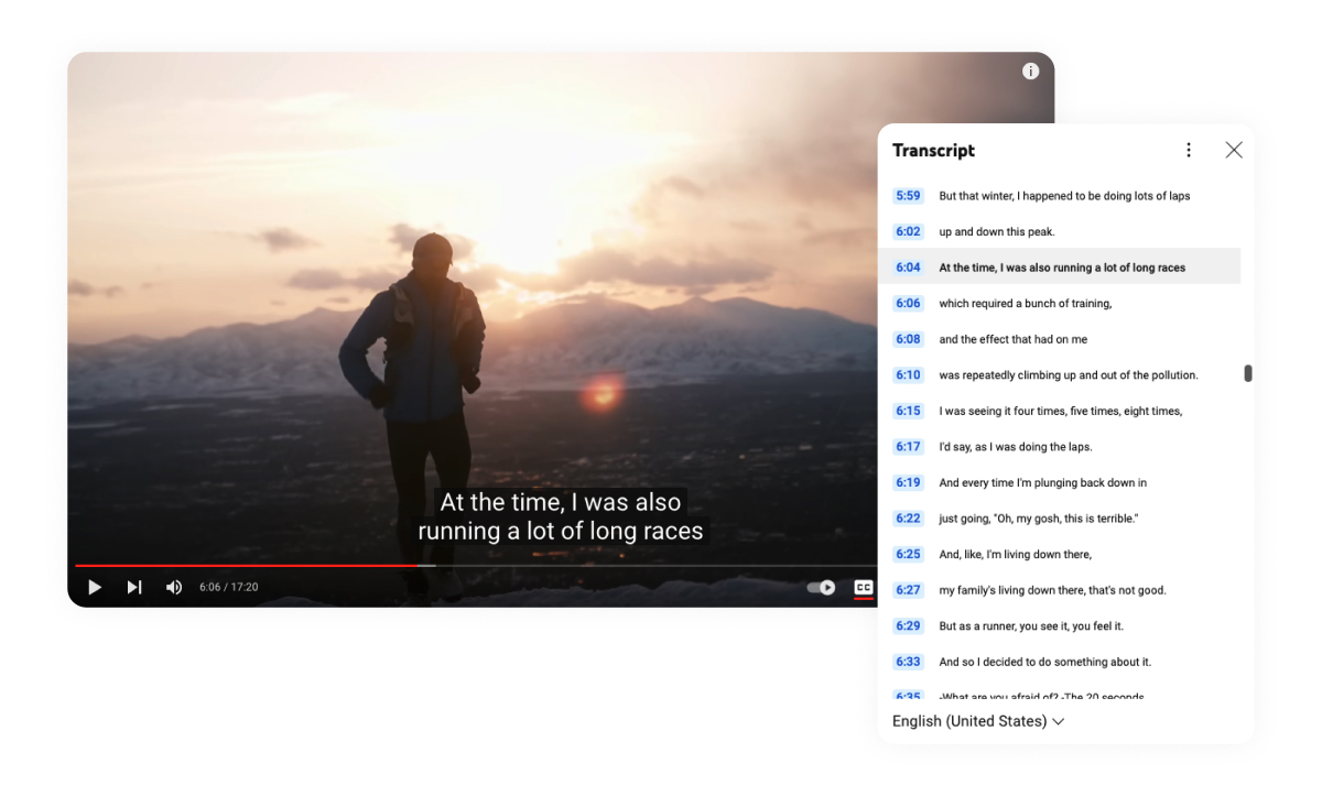
Provide video transcripts
Providing video transcripts is not only a great way to improve accessibility for deaf or hard-of-hearing users, but it also offers an SEO advantage. Search engines like Google cannot “watch” videos, but they can index text-based transcripts. This helps search engines understand and rank your video content, making it more discoverable.
Boost your online presence with our help
- Web design and development
- SEO and PPC
- Social media strategy
- AI technology
How to create and display transcripts
There are several tools you can use to create transcripts from voice to text automatically. While manual transcription is the most accurate, these tools provide a great starting point:
- Google Docs voice typing (Chrome): A straightforward, free tool for creating transcripts directly within Google Docs.
- Apple Dictation (iOS, iPadOS, macOS): Built-in dictation tools for Apple devices.
- Windows 11 Speech Recognition: A speech recognition tool integrated into the Windows operating system.
After creating your transcript, display it clearly on your website, either directly below the video or as a downloadable text file. This makes it easy for users to access, regardless of how they prefer to engage with your content.
💡 Tip: Your video transcripts can also be repurposed for other content. For example, pull key quotes or segments from the transcript to use in social media posts, streamlining your content strategy.
Making transcripts searchable
For better usability, ensure your transcripts are searchable. Here’s how:
- Use plain text or HTML: Do not embed transcripts as PDFs or images, which are harder for search engines to index and users to search through.
- Add timestamps: Timestamps help users jump to specific parts of the video within the transcript. For example, “[03:15] Discussion on how our non-profit achieved its 2023 goals.”
- Organize with headings: Break your transcript into sections with clear headings to help users scan content more easily.
By creating searchable, accessible transcripts, you improve both the usability of your content and your website’s SEO performance, reaching a wider audience with your nonprofit’s message.
3. Simplify content and layout
A clean, user-friendly website layout with clear, simple content is critical for keeping visitors engaged. Whether they’re potential donors, volunteers, or people looking for support, your site should guide them seamlessly to the information they need.
In this section, we’ll discuss how to simplify menus, structure content for readability, and ensure your site is accessible on all devices.
Use simple and clear language in your menu
The language in your navigation menu is the first thing users encounter, so it needs to be straightforward and intuitive. Avoid technical jargon or industry-specific terms that might confuse new visitors before they’ve had a chance to learn about your organization. Instead, use universal labels like “What We Do,” “Our Services,” or “Products.” Brand-new visitors should immediately understand the links in your menu, without having to guess where to find the information they need. This leads to a smoother and more user-friendly experience.
Use breadcrumbs to guide navigation
For non-profits with more content-heavy websites, breadcrumbs are a valuable tool for helping users navigate pages that are more than one step away from the homepage. Breadcrumbs show users the path they’ve taken and allow them to quickly return to previous sections.
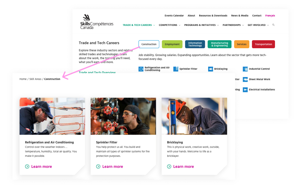
Skills Canada uses breadcrumbs to help users keep track of where they are on the site and easily move back to previous pages. This is especially helpful when navigating through career paths and competitions, where users might want to retrace their steps without using the back button multiple times. Implementing breadcrumbs improves usability and reduces the chance of visitors feeling lost on your site.
Make it easy to take action with clear conversion buttons
Your website’s menu should provide easy access to the main action you want visitors to take, whether that’s donating, signing up for a newsletter, or joining an event. By placing conversion buttons in prominent locations – usually the top right – you guide users to the actions that drive your mission forward.
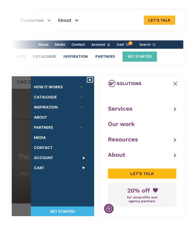
For example, U7 Solutions includes a “Let’s Talk” button in the navigation menu, making it easy for users to take the first step toward working with them. Similarly, Swedish Door’s website features a clear “Get Started” button, helping users quickly find the next step to making a purchase. For non-profits, this could translate to a “Donate Now” or “Get Involved” button that clearly stands out in the menu on desktop and mobile!
Keep your main content clear and easy to read
Using clear, simple language throughout your website helps make your content accessible to a wide range of visitors. This approach is especially important for users with cognitive disabilities, people with lower literacy levels, or those unfamiliar with your organization and its services. Plain language helps ensure that your message reaches everyone.
When your content is easy to understand, you break down barriers to engagement. Visitors don’t have to struggle with complicated terms, industry-specific jargon, or long-winded explanations. Instead, they can quickly grasp your message, which creates a more positive user experience. For non-profits, where trust is built through clear communication, this is crucial.
Tips for writing clear, concise copy:
- Use short sentences: Simple, straightforward sentences are easier to follow.
- Avoid jargon: Stick to everyday words all audiences will understand.
- Write for your audience: Consider the needs and reading levels of your users when crafting content. For many non-profits, this might mean simplifying complex subjects into digestible, plain language.
- Be concise: Get to the point quickly—don’t overwhelm users with walls of text.
Organizing content for readability
Readable content isn’t just about the words you use—it’s also about how you organize them on the page. A well-structured layout helps users find information quickly and absorb it more easily.
- Use headings: Break up content with clear headings (e.g., <h2>, <h3>) to create a visual hierarchy. This helps users (and screen readers) navigate your content.
- Bullet points and lists: When presenting information, lists and bullet points are much easier to scan than long paragraphs. Use them whenever appropriate.
- Short paragraphs: Keep paragraphs short—around 3-4 sentences each. This makes the text easier to read and less overwhelming.
- White space (the empty space around text and images) is just as important as the content itself. It helps reduce clutter and allows users to focus on the important parts of your page. Similarly, a visual hierarchy—using different text sizes, bolding, and colors—guides users’ eyes to the most important elements.
This combination of white space and visual hierarchy enhances readability and keeps users engaged with your content.
4. Make sure your website is responsive
Your audience will likely visit your website from a variety of devices—desktops, laptops, tablets, and smartphones. Ensuring your website is mobile-friendly with a responsive design that adapts to any screen size is crucial to providing a seamless experience.
With an increasing number of users accessing websites via mobile devices, a responsive website isn’t just a bonus—it’s essential. If your site doesn’t work well on mobile, you risk alienating users who can’t easily navigate, read content, or complete forms on their devices.
Responsive design tips:
- Use a mobile-first approach: Start by designing your site with mobile users in mind, ensuring that all essential features (like menus, buttons, and forms) are easily accessible on small screens.
- Test across devices: Make sure your website is thoroughly tested across various screen sizes and devices, from smartphones to large desktop monitors.
- Simplify your mobile designs: Consider removing animations, GIFS or other elements that may slow down or impede the mobile experience.
- Keep your text concise: It takes way longer to scroll down lengthy paragraphs on a narrow mobile screen vs. desktop – which is yet another reason to simplify your content overall (see point 3).
- Don’t rely on hover states: Make sure no important text is hidden behind a hover state, for example, a card with a title that shows a longer description when hovered over. This content will be completely lost on mobile.
- Avoid pop ups: These can be hard to close on mobile devices. Consider disabling any pop ups on your mobile site, or redesigning them as a pop-in – a message that only takes up part of the screen. If you go this route, ensure it is easy to close by testing it on a few different devices.
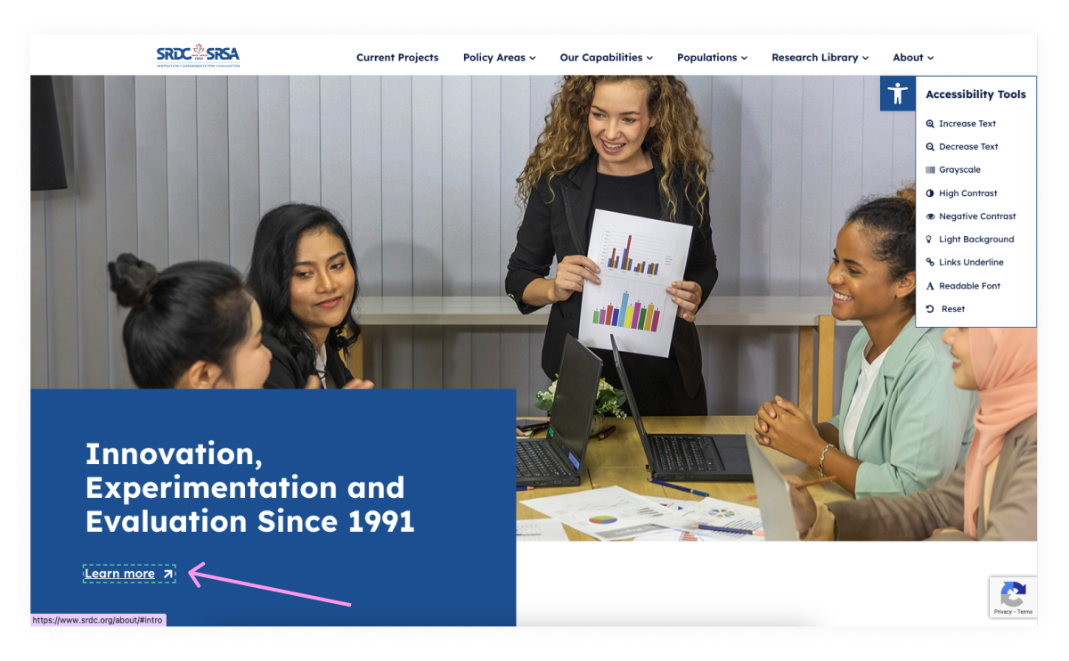
5. Optimize your site for screen readers
Screen readers are software programs designed to assist blind or visually impaired users by reading the text and elements on a webpage out loud or converting them into Braille (a form of written language).
Popular screen readers include JAWS (Job Access With Speech), NVDA (NonVisual Desktop Access), and VoiceOver for macOS. These tools rely on the underlying structure of the website to help users navigate content and interact with elements like buttons and links.
For websites to work well with screen readers, it’s crucial to structure content logically and make use of certain HTML elements designed to improve accessibility.
Proper use of HTML tags
Semantic HTML means using the appropriate HTML tags to describe the meaning of content on a webpage. For example, using <header>, <nav>, <section>, and <footer> tags gives structure to the page that screen readers can recognize. These elements help users quickly navigate through different sections of a webpage, making it easier to access relevant information.
Using the right tags doesn’t just make the content more readable for screen readers—it also improves search engine optimization (SEO) and creates a clearer structure for all users.
Structuring content with headings
One of the most important aspects of making your site accessible for screen readers is proper heading structure within the text. When you organize your content with headings (like <h1>, <h2>, <h3>, etc.), you create a hierarchy that helps screen readers navigate more efficiently.
- Start with one <h1> per page: This tag is for the main title of your webpage and signals the primary topic. There should only be one <h1> per page to avoid confusion.
- Use <h2>, <h3>, etc., for subheadings: Break your content into smaller sections by using descending heading levels, which allows screen reader users to “skim” the content just as sighted users would.
Organizing content with headings not only enhances accessibility but also makes your content more scannable and user-friendly.
Alternative text for images
Alternative text (alt text) is used to describe the content and purpose of an image for screen reader users. When a screen reader encounters an image, it reads the alt text aloud, helping blind users understand the image’s function. For example, a non-profit organization might have an image of volunteers planting trees, and the alt text could describe this as: “Volunteers planting trees at our annual community event.”
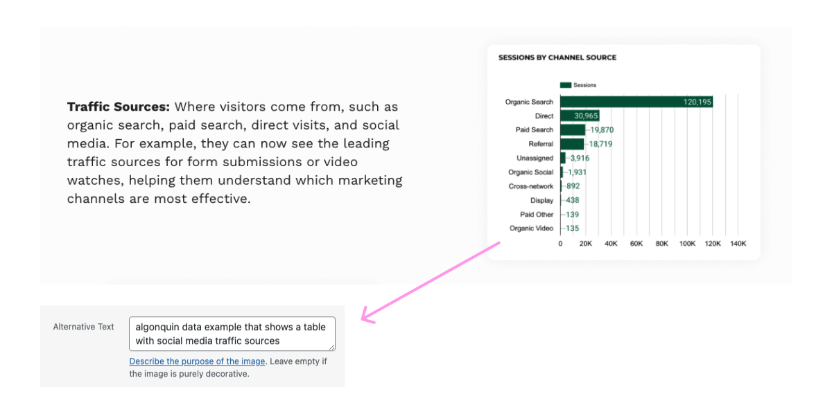
Writing alt text is a balancing act between being descriptive and concise. Here are some key tips:
- Be specific: If the image contains important details, make sure to mention them. For example, instead of writing “Picture of volunteers,” say “Three volunteers planting trees during the 2023 community cleanup event.”
- Avoid redundancy: There’s no need to start with “Image of” or “Picture of,” as screen readers already know it’s an image.
- Be concise: Keep alt text brief but informative—generally, one or two sentences is enough.
- Use empty alt text for decorative images: If an image is purely decorative (e.g., a background image), it’s best to leave the alt attribute empty (alt=””). This tells the screen reader to skip over it.
Effective alt text helps visually impaired users gain the same context that sighted users receive from the images on your site.
ARIA landmarks
ARIA landmarks (Accessible Rich Internet Applications) are attributes you can add to your HTML to provide extra context about different regions of your website. They help screen readers identify key parts of the page, such as the main content, navigation, and search areas. This makes it easier for users to jump between sections and find what they’re looking for without having to listen to the entire page.
Implementing ARIA landmarks to improve navigation
ARIA landmarks are particularly useful for complex websites with a lot of interactive elements. By adding ARIA roles such as role=”banner”, role=”navigation”, or role=”main”, you can clearly define areas of the page for screen readers. Here’s a quick guide to the most commonly used ARIA roles:
- role=”banner”: Marks the header section of the website.
- role=”navigation”: Identifies the navigation menu.
- role=”main”: Specifies the main content area.
- role=”complementary”: Marks supplementary content like sidebars or related content.
- role=”search”: Identifies the search section of the site.
By implementing ARIA landmarks, you create a clearer structure for screen readers to follow, improving the user experience for visually impaired visitors.
6. Ensure keyboard navigation
For users who can’t use a mouse—whether due to a permanent motor disability, a temporary injury, or personal preference—keyboard navigation is essential.
These users rely on the Tab, Enter, Space, and Arrow keys to interact with websites. For example, users may press the Tab key to move from one interactive element (like a link, button, or form field) to the next, and use Enter or Space to activate buttons or links. If your website isn’t set up for keyboard accessibility, these users may be unable to fill out donation forms, navigate between pages, or engage with other key elements on your site.
By ensuring that your non-profit’s website is optimized for keyboard accessibility, you open your digital doors to a wider audience, making it easier for them to engage with your mission.
Creating a keyboard-friendly website
Here are some best practices for making your website accessible for keyboard users:
- Ensure all interactive elements are focusable: Links, buttons, and form fields should be navigable using the Tab key. Use semantic HTML for interactive elements, such as <button>, <a>, and <input>, as these are naturally focusable and keyboard-friendly. Avoid using non-semantic elements (like <div> or <span>) for interactive features, unless you specifically add the necessary keyboard support (such as tabindex).
- Use logical focus order: Ensure the Tab key moves through elements in a logical order, following the layout of the page from top to bottom or left to right. By default, the focus order follows the HTML structure, but it can be customized using the tabindex attribute if necessary.
- Make dropdowns, pop-ups, and modals accessible: Ensure that dropdown menus and modal windows are keyboard navigable. Users should be able to open a menu or modal with the Enter or Space key and use the Arrow keys to move between items.
The importance of focus indicators and how to customize them
Focus indicators are essential for users navigating with a keyboard because they visually show which element is currently in focus. When a user presses the Tab key, the next interactive element (such as a link, button, or form field) should be highlighted with a border, outline, or other clear indicator.
Customizing focus indicators:
Browsers provide default focus styles, but it’s a good idea to customize them to make the indicators more visible and align with your site’s design. For example, you could use your brand’s color palette to highlight the focus indicator. A simple CSS rule like the one below can enhance the default focus style:
Ensure the focus indicator stands out clearly against the background and has a strong contrast (see point 1). This is especially important for users with low vision who rely on visible cues to navigate the page.
Testing tools for keyboard navigation
Testing is critical to ensuring your site is fully accessible via keyboard. Here are some methods and tools you can use:
- Manual keyboard testing: Unplug your mouse and try navigating your site using only the keyboard. Focus on how the Tab key moves between elements, whether interactive elements are focusable, and whether focus indicators are visible.
- Chrome DevTools Keyboard Accessibility Test: Chrome’s DevTools provides tools for inspecting and debugging keyboard accessibility issues. You can use it to check focus order, identify non-focusable elements, and simulate keyboard navigation.
- WAVE Web Accessibility Evaluation Tool: WAVE is a free tool that tests for various accessibility issues, including keyboard navigation. It highlights problems such as missing focus indicators or elements that can’t be accessed via the keyboard.
By regularly testing your site’s keyboard accessibility, you can catch and fix potential issues before they impact your users.
7. Regular accessibility testing
Ensuring your non-profit’s website is accessible isn’t a one-time task—it’s an ongoing process. Regular accessibility testing helps you maintain an inclusive website and identify areas that need improvement as web technologies and standards evolve. In this section, we’ll cover the importance of continuous testing, provide recommendations for testing tools, and highlight the value of getting feedback from real users with disabilities.
Web accessibility isn’t a “set it and forget it” task. Websites are constantly changing—whether it’s content updates, new features, or third-party integrations—which means accessibility can fluctuate. For example, a new form might be added without proper focus indicators, or an embedded video could lack captions. That’s why continuous accessibility testing is critical.
Regular testing ensures that your website continues to meet accessibility standards, such as WCAG 2.1, and provides a seamless experience for all users. Moreover, testing helps identify new issues before they become barriers for your audience, giving you the opportunity to address them proactively.
Accessibility isn’t just about compliance—it’s about creating an inclusive environment that welcomes everyone to engage with your cause. By adopting a mindset of continuous improvement, your non-profit can ensure that your digital presence remains welcoming to all users, including those with disabilities.
Accessibility testing tools
There are several excellent tools available that make auditing your website accessibility straightforward:
- WAVE (Web Accessibility Evaluation Tool): WAVE is a free, browser-based tool that highlights accessibility issues on any webpage. It identifies missing alt text, improper heading structures, and other common problems. WAVE also provides visual feedback directly on the webpage, making it easy to see where improvements are needed.
- Axe: Axe is a powerful accessibility testing tool that integrates directly into Chrome DevTools. It helps you conduct in-depth audits of your site’s accessibility and can pinpoint complex issues like missing ARIA attributes or improper keyboard navigation.
- Lighthouse: Lighthouse is an open-source tool from Google that audits webpages for accessibility, performance, and SEO. It provides an overall accessibility score, which can help you gauge how well your site performs. This tool is especially helpful for identifying mobile accessibility issues.
Automated and manual testing
While automated tools like WAVE, Axe, and Lighthouse are excellent for catching many common accessibility problems, they shouldn’t be your only approach. Some issues, such as poor color contrast in real-world settings or the usability of a form for screen reader users, require manual testing. Here’s how you can incorporate both approaches:
- Automated testing: Use tools like WAVE and Axe regularly to scan your website for code-related accessibility issues. They are particularly good at catching problems like missing alt text, incorrect heading structures, and lack of ARIA attributes.
- Manual testing: Go beyond automation by manually testing your site. This can involve tasks like using only the keyboard to navigate (to check for focus order and interactive element accessibility), reviewing content with screen readers (like JAWS or VoiceOver), and ensuring that content can be accessed and understood by people with different types of disabilities.
Manual testing helps catch the human-centered issues that automated tools often miss, ensuring a more user-friendly and inclusive experience.
The value of real-world feedback
While automated and manual testing can catch many accessibility issues, the most valuable insights often come from real-world testing with users who have disabilities. These users bring authentic experiences and can provide feedback that tools alone can’t capture.
For example, a user with motor impairments may encounter difficulties with your site’s form fields, or a blind user might find navigation confusing despite all ARIA roles being properly implemented. Getting this direct feedback helps identify usability challenges that would otherwise go unnoticed.
To involve users with disabilities:
- Partner with accessibility organizations: Many organizations focus on assisting people with disabilities and may offer testing services or help connect you with testers who can provide meaningful feedback on your website.
- Offer usability tests: Host regular user testing sessions where people with disabilities navigate your website. Ask them to complete tasks like finding a piece of content, making a donation, or signing up for a newsletter. Their feedback will help you identify specific areas that need improvement.
This real-world input is essential for creating a truly accessible and inclusive website. By testing your site with people who rely on assistive technologies, you gain a better understanding of the barriers they face and how to remove them.
Key takeaways for building an accessible website
To recap, here are the key actions your non-profit can take to improve website accessibility:
- Use accessible colors: Ensure sufficient contrast for users with low vision or color blindness.
- Provide accessible video content: Add captions and transcripts to reach users with hearing impairments.
- Simplify content and layout: Clear, simple language and clean design make it easier for all visitors to engage.
- Make your site responsive: Ensure your website works smoothly on all devices, especially mobile.
- Optimize for screen readers: Use proper HTML tags, headings, and alt text to enhance navigation for visually impaired users.
- Enable keyboard navigation: Ensure all interactive elements are accessible via keyboard.
- Conduct regular accessibility testing: Continuously test your site to catch and fix any accessibility issues.
Making your website accessible is essential for creating an inclusive digital space that welcomes all visitors, regardless of ability. By improving your site’s usability, you enhance user experience and expand the reach of your mission.
At U7 Solutions, we help non-profits design websites that are accessible AND impactful. If you’re looking for expert guidance, feel free to book a meeting or download our accessibility white paper for a free resource you can share with your team.
Related posts


Let's chat about your goals
OR tell us more about you
Swipe up for expert help!