"*" indicates required fields
Your non-profit website can do more, and these 3 case studies prove it
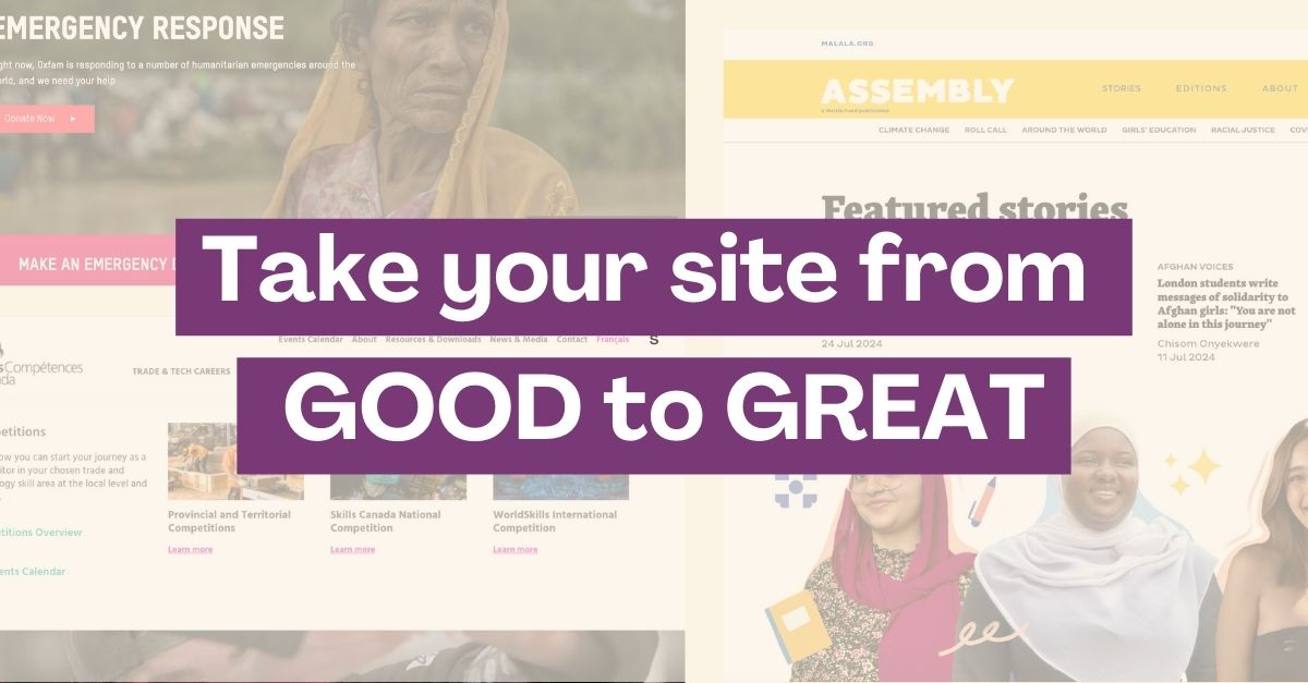
For many non-profits, their websites do the bare minimum—providing basic information, a contact form, and maybe a donation page. Some are outdated, hard to navigate, or don’t reflect the mission they’re meant to support. Sound familiar?
The good news: turning an underwhelming website into an engaging online community is entirely possible. With the right strategy you can connect with your audience, increase donations and share your mission.
Are you ready to take your website from good to great?
These 3 short case studies prove that the right changes can make a world of difference.
Example 1: Capturing your audience by involving them in the design process
Organization: Assembly, Malala Fund
Industry: Non-Profit/Education
Results: Vibrant new design, increased website traffic
Assembly, Malala Fund’s digital publication for girls, empowers young women from over 100 countries to share their stories in over 20 languages. Malala Fund’s redesign approach was unique: they involved nine Assembly contributors from Algeria, Brazil, India, Iraq, Japan, Nigeria, Mexico, and the U.S. in the process.
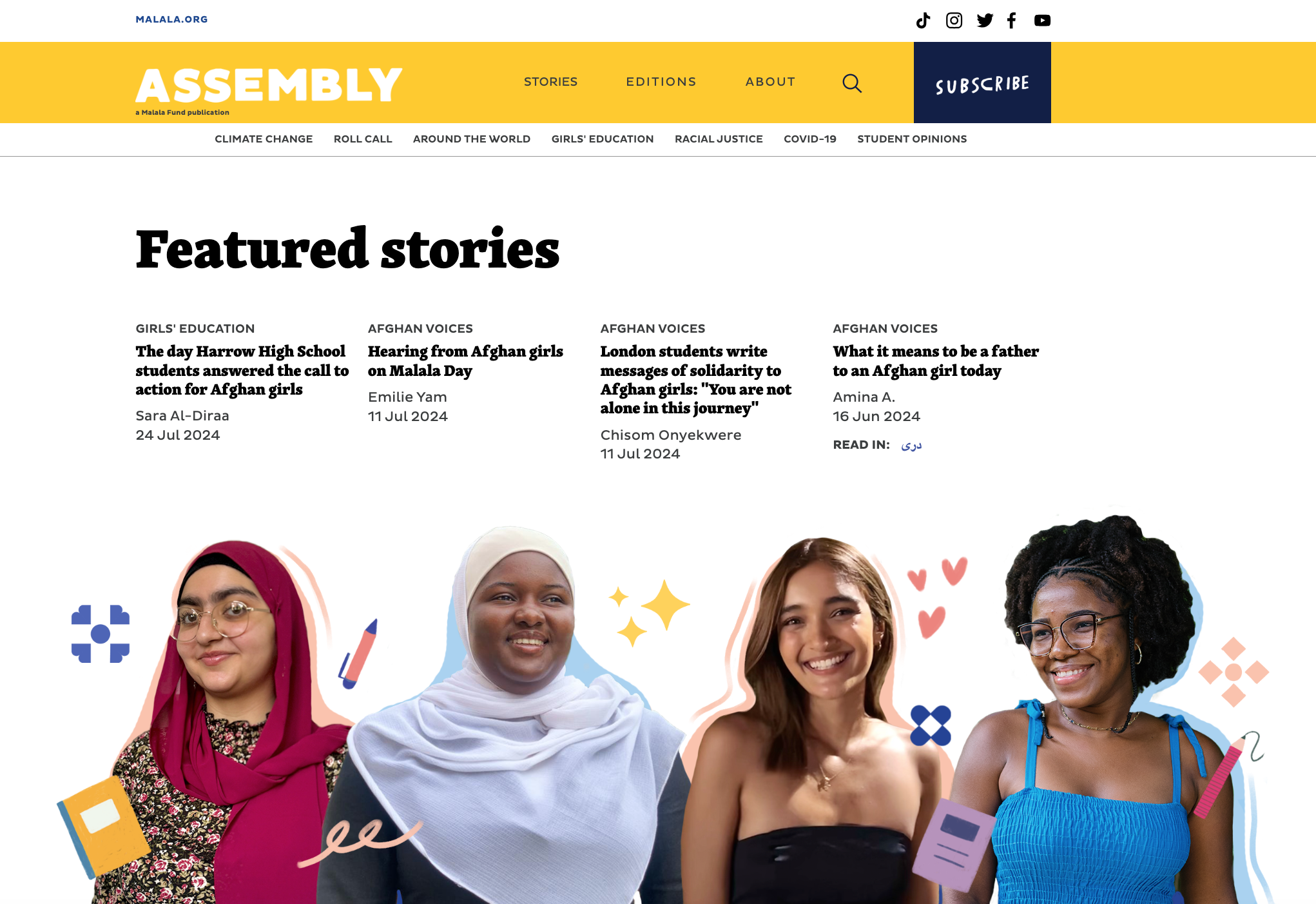
These young women played a key role in design reviews and user testing, ensuring the redesign reflected their needs and preferences. This input resulted in a website that feels welcoming, engaging, and user-friendly.
The challenge? Merging a vibrant, visually rich design with a fast, responsive site. By working with designers to optimize media files and develop a bold new color scheme, the team achieved a balance of beauty and performance.
As Ayesha Shakya, Digital Content Producer at Malala Fund, said, “Designing the website with our audience in mind was crucial. We aimed to create a platform that truly represents our community, which was only possible with input from the girls who make Assembly what it is.”
Key takeaway ➡️ Involve your audience in the redesign process. By incorporating their feedback, you’ll create a non-profit site that truly reflects their needs and values. Don’t be afraid to embrace bold visuals—think of your site as the colorful centerpiece of your digital garden.
Boost your online presence with our help
- Web design and development
- SEO and PPC
- Social media strategy
- AI technology
Example 2: Inspiring more donations with better storytelling
Organization: Oxfam Canada
Industry: Non-Profit/International Development
Results: streamlined navigation, immersive visuals, improved accessibility
Oxfam Canada needed to engage a younger, socially conscious audience while driving support for gender equality. The project went beyond redesigning the website; it reimagined how digital storytelling could fuel the movement.
Simplification was the first step. After consulting with stakeholders, Oxfam Canada reduced the number of web pages by 50%. This streamlining made navigation more intuitive and ensured visitors could find what they needed effortlessly.
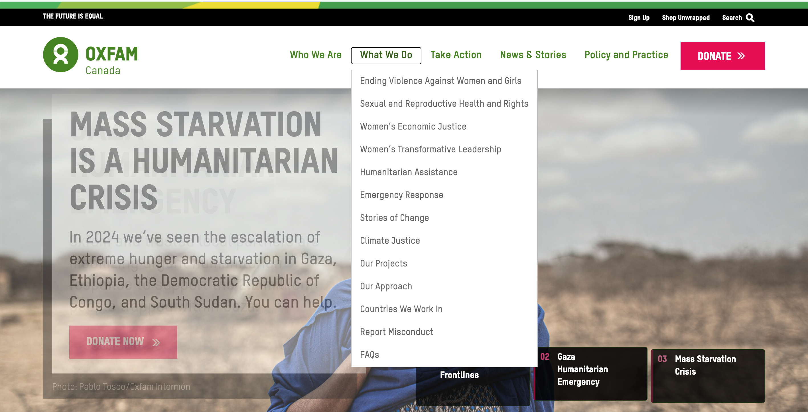
Visual storytelling became a cornerstone of Oxfam’s online strategy. For example, one campaign highlighted the story of Amina, a young girl in Somalia who overcame hunger through Oxfam’s community support initiatives. Her story was paired with immersive visuals and a call to action, helping visitors see the direct impact of their contributions. This emotional approach engaged visitors, driving support and deepening their connection to the cause.
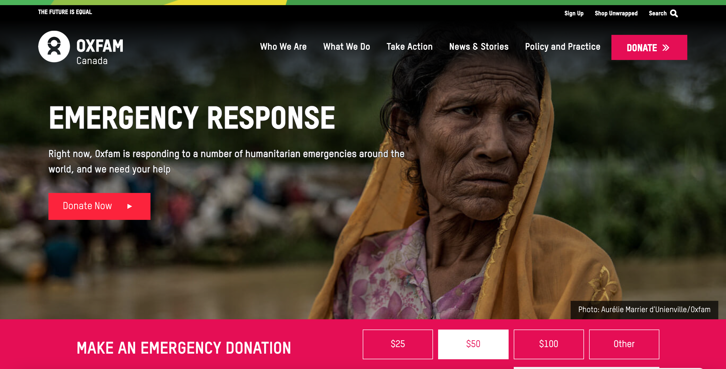
Inclusivity was another high priority. By updating the color palette, iconography, and visuals to meet accessibility standards, Oxfam Canada ensured the website was usable for everyone.
Key takeaway ➡️ Simplify navigation and invest in compelling visuals. An accessible, visually engaging non-profit website can inspire your audience and amplify your mission.
Example 3: Meeting your audience’s needs with improved content and navigation
Organization: Skills/Compétences Canada (SCC)
Industry: Non-Profit/Technology and Skilled Trades
Results: User-centered navigation, improved site speed, updated branding
Skills/Compétences Canada, a Canadian non-profit promoting careers in technology and skilled trades, faced a significant challenge: their decade-old website was no longer meeting the needs of students, parents, and educators. SCC needed a complete transformation to better serve their audience.
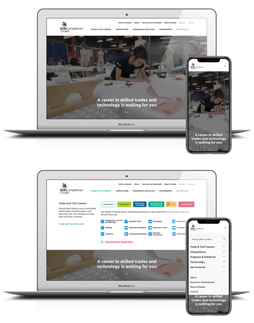
Partnering with U7 Solutions, SCC approached the redesign with a focus on usability, interactivity, and alignment with their audience’s goals. The new site features a clean home page and a mega-menu that makes it easy for users to find programs and initiatives. A skilled trades school map was also introduced, providing up-to-date details on salaries, career paths, and educational opportunities across Canada.
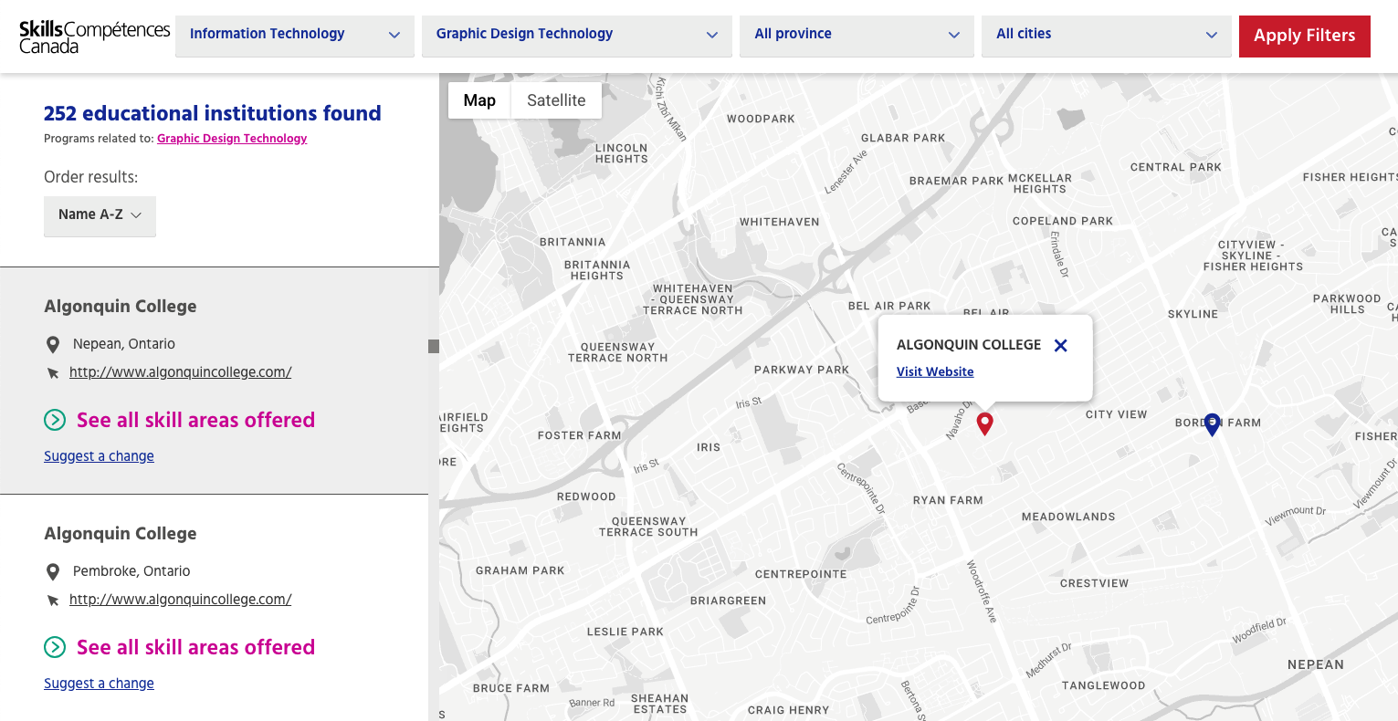
Behind the scenes, migrating to a modern server significantly boosted site speed, while SEO best practices ensured better visibility in search engines. Overall, the new website serves as a comprehensive resource for youth, parents and educators across the country, effectively promoting skilled trades careers.
Want to learn more about this project? Check out our in-depth case study.
Key takeaway ➡️ Prioritize audience needs when redesigning your non-profit website. By simplifying navigation and introducing tools like interactive maps, you can create a user-centered platform that not only reflects your mission but also engages and informs your audience effectively.
Ready to take your website from good to great?
As these case studies show, even established non-profits can benefit from rethinking their online strategy. Whether it’s streamlining navigation, embracing new visuals, or adding interactive features, the right updates can make your website work for you and bring you closer to meeting your mission.
If your site feels like it’s “just good enough,” now’s the perfect time to make a change. At U7 Solutions, we specialize in building websites for non-profits like you.
Book a free consultation today to find out how we can help!
Book a free consult to discuss your goals
Swipe up for expert help!
