Is your web content confusing your users?
It can be so easy to be blown away by the pretty designs and cool animations on a website.
But before you even see the beautifully branded website design, lots and lots of work goes on behind the scenes during the initial planning phase to ensure that the website is structured in a way that is understandable, simple, and crawlable.
Mapping out a good site structure is a lot more technical than other web design, content, or SEO tasks. It’s not the most fun or creative part of the website building process, but it’s one of the most strategic parts. If it’s done well, it will certainly pay off.
What is site structure?
Here’s a good summary from Uxpin.com on what site structure is:
“Your site’s structure is how the different pages on your site are linked with each other using internal links and their hierarchy. It is how the information on your site is organized and presented so that the algorithm can read its context well. Good website structure facilitates easy navigation for both users and crawlers which improves the SEO ranking of your website in search engines.”
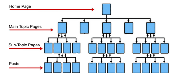
Site structure matters to your users, and to search engines like Google, so it certainly matters to you as a business owner with a website. Let’s take a closer look at why.
Why site structure matters to your users
1. Good site structure makes navigation easier
Think of the last time you were at a grocery store; how often do you observe the overhead signs which label the categories in each aisle so that you can decide whether or not you want to spend time in that aisle? Will you bother looking for pet food in an aisle that is labeled ‘cleaning supplies’?
That’s exactly why easy navigation matters on your website. Good site structure lets users know they’re in the right place and offers them a clear segue to the next action in their decision-making process.
Menus are a great example of site navigation. When we built a website for our client Jaiko Cleaning Services, we structured their site to follow a clear hierarchy according to their services.

The menu shows that ‘cleaning services’ is the general umbrella under which all their services fall under. Then there are 2 types of cleaning services:
- Commercial cleaning
- Residential cleaning
This distinction guides Jaiko’s two kinds of clients; the ones looking for cleaning for their home and the ones who need cleaning for a commercial space. When clicking on either of those options from the menu, it takes the user to another page that breaks down exactly which services are offered for the type of cleaning they want.
2. Good site structure pairs well with a visual hierarchy
As our graphic designer Madeleine said in her blog, visual hierarchy refers to the placement of text or elements in a design, to show the order of importance or guide the user experience.
Hierarchy determines the order that your viewer is going to see the elements:
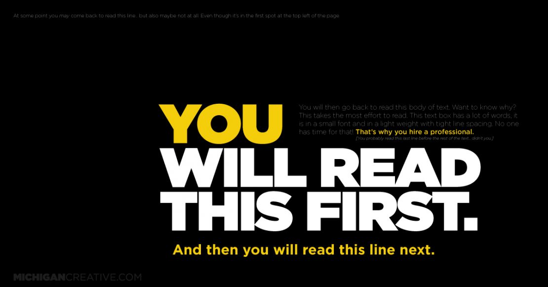
You could have a perfect site structure, but without a visual hierarchy to communicate to your users, they won’t be able to immediately tell how your services/products work.
Having both and ensuring that they complement each other is what makes the whole experience for the user seamless and captivating.

Boost your online presence with our help
- Web design and development
- SEO and PPC
- Social media strategy
- AI technology
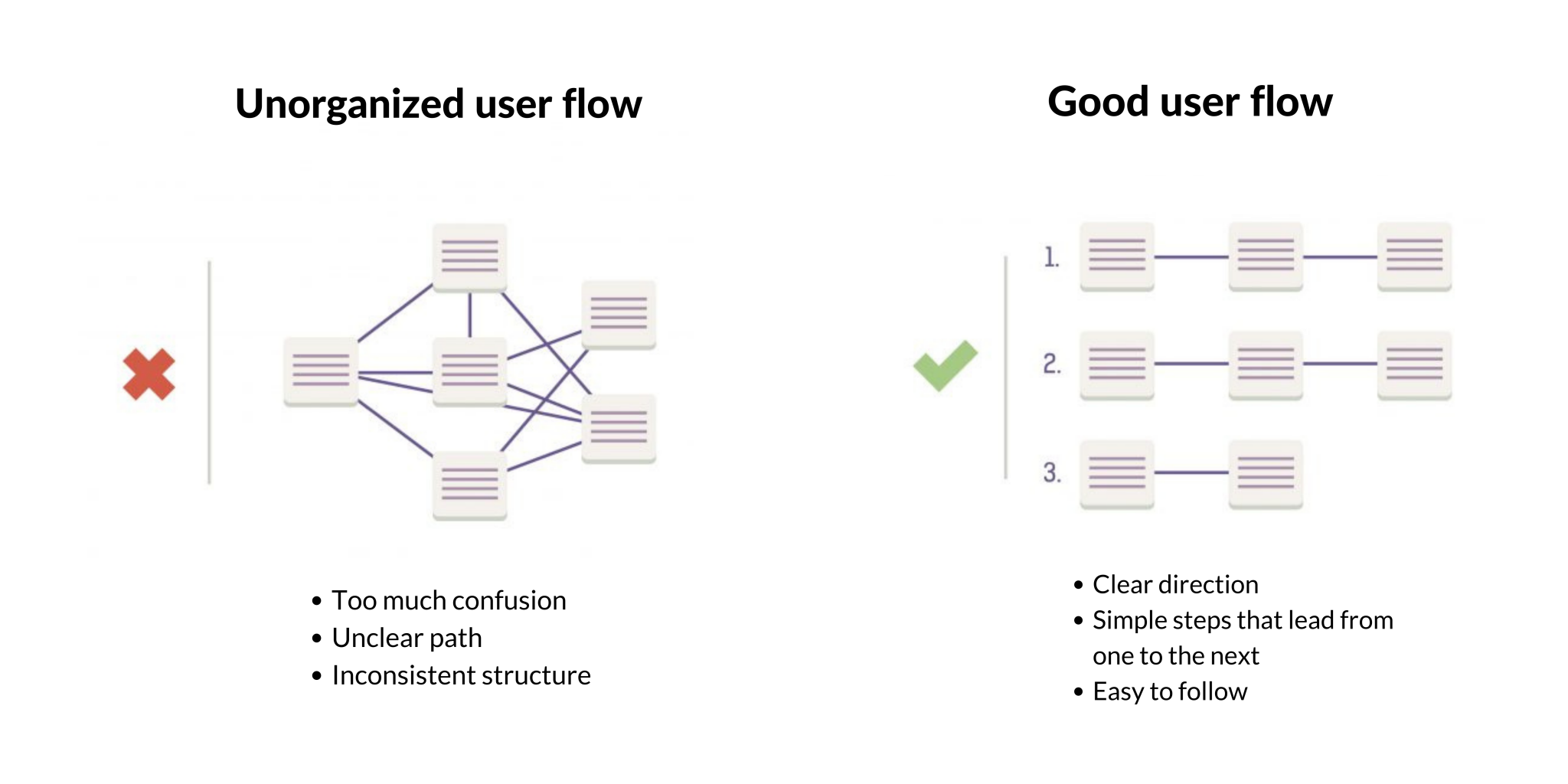
3. Good site structure creates versatile user flows
Think about user flow like directions when driving; there are multiple routes you can take to get to the same destination. The critical part is that different drivers take different routes from each other, even if they arrive at the same place.
When users land on a website, not everybody is going to immediately click the page that you anticipate.
This is why it’s important to structure your website strategically by accounting for different user flows so that anyone who visits will be able to use your website seamlessly.
Why site structure matters to search engines
Ever wonder what happens behind the scenes when a user searches a query in a search engine?
When you type something into Google and click ‘search,’ Google will start crawling all the pages in their index that match that query the best. Here’s a video that explains this process in detail. Two things worthy of note are as follows:
1. Good site structure helps you avoids self-competition
Your site structure tells Google which pages of yours are a high priority. If you don’t have a solid site structure, you might end up competing with yourself in search results.
For example, if you have 2 blog posts both about digital marketing, Google won’t know which one is important which will make it harder for either of them to show up when a user searches ‘digital marketing.’ This is counterproductive, ironically doing the exact opposite of what your blogs were intended to do.
To avoid being your own competitor, make sure your website has a good internal linking structure, which can be implemented during the website development process.
2. Good site structure is rewarded with sitelinks in search results
Sitelinks are hyperlinks that appear in search results that take people directly to specific pages on your website. They are a huge advantage when it comes to your SEO. Here are U7’s sitelinks as seen on Google:
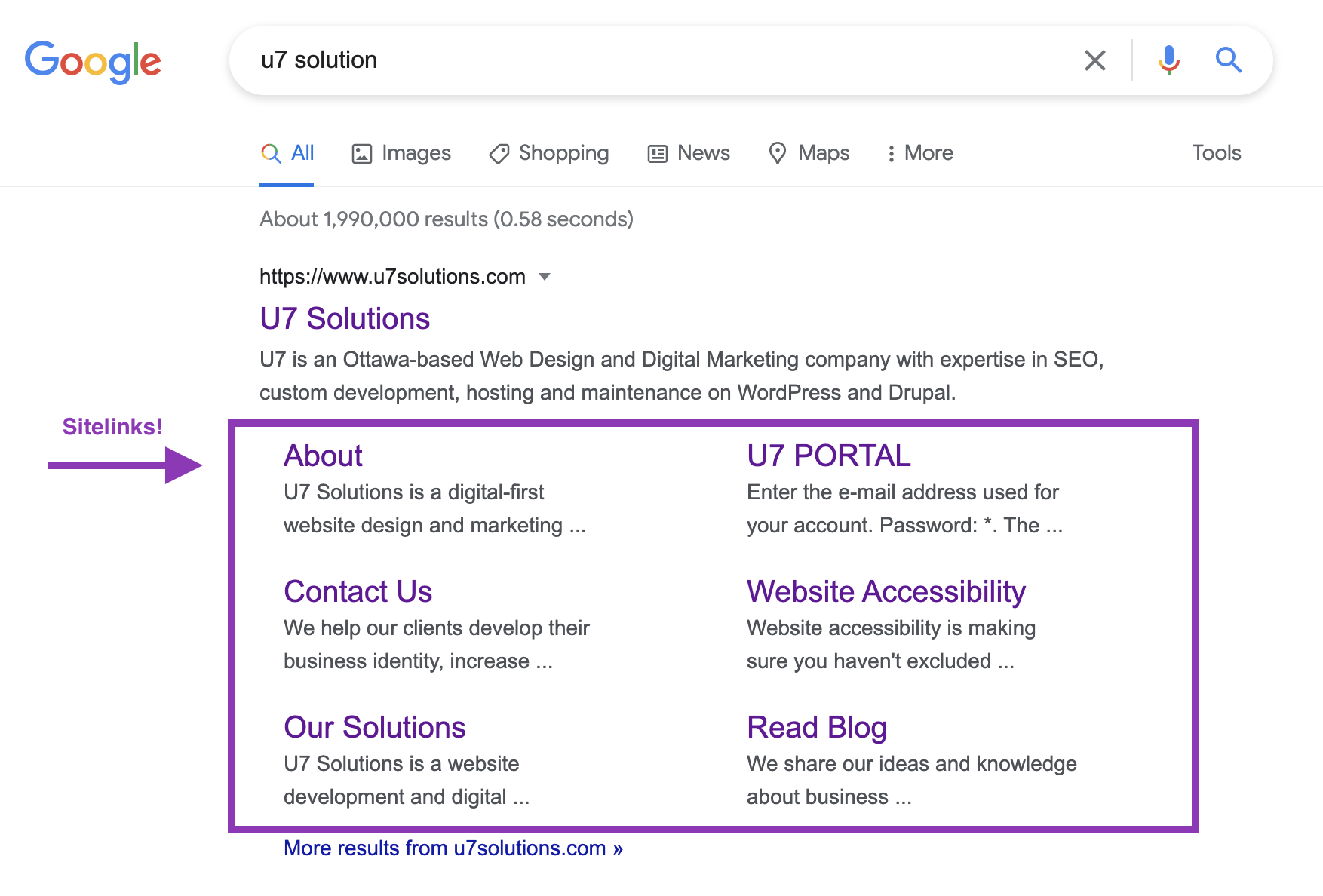
Important things to know about sitelinks:
- As the site owner, you cannot add any sitelinks, and neither can we. Google adds them through their own secret automated algorithms (source).
- This means that having sitelinks is Google’s way of confirming to you that they find your site structure trustworthy, hence favouring your pages in their search results.
- Though there isn’t a direct way to get sitelinks, improving your site structure simultaneously improves your chances of being trusted by Google.
3. Good site structure is optimized for SEO
The better your site is structured, the better it will perform on search engines. Even if nothing else is being considered, the MOST important reason to have a well-structured site is because of SEO.
Google LOVES a good site structure because they can crawl it easier. This means they can scan your website because the structure is easy to follow, and they’re able to index content from your website to display to a user.
If you’re wondering whether or not your site is optimized to rank on Google, check out our SEO assessment.
Ready to perfect your site structure?
At U7, we plan our clients’ website architecture by considering their volume of content, types of content, naming of pages and links, as well as user navigation. We then produce a site map and work with our clients to identify what content is being kept, updated, removed, and added.
See our website design page to read about our process, or book a FREE consultation with us today!
Let's chat about your goals
OR tell us more about you
Swipe up for expert help!

