"*" indicates required fields
Rebuilding the Tulip Festival website

The importance of content structure
Working on the Tulip Festival website was a fun project because there was an information management (IM) problem I knew I could solve. Yeah, I know the term (IM) sounds boring, but managing information is a real challenge that many businesses struggle with.
Each year, the Tulip Festival team has to create a new program with approximately 150 sponsors and 100 activities across 4 venues. The coordination efforts needed to assemble the program itself are complicated enough; having to worry about how to post, format, and organize all that information on the website, in both official languages, often led to internal chaos, delays, inconsistencies, duplication of efforts, and errors.
The end-user experience also suffered because important pages like the schedule, the sponsor list, and the homepage had to be updated manually—meaning that if details about an event changed, all references of that event across the site had to be located and updated individually, leading to errors and inconsistencies. You can imagine how time consuming and frustrating that would be.
When we came on board, it was apparent to me that the content was a lacking structure. The site was built on WordPress, and yes this is a content management system, but when you have this kind of volume and type of content, the standard “post” and “page” content types that WordPress provides are simply not sufficient. A content management system enables you to add information to your website without needing a computer science degree, but it doesn’t structure the information for you.
Content without structure inevitably leads to errors, headaches, and wasted time.
The Tulip Festival team needed a content structure that would allow them to input and edit activities with their associated info for venues, genres, and sponsors. This way, the team could easily manage the data on the back-end with much less work involved, and festival-goers would enjoy an enhanced user experience on the front-end of the site.
Before I dive into to what we did, I’d like to give a shout-out to my good friend Peter Georgariou from KarmaDharma – strategy + marketing who’s team designed the beautiful interface and branding with the artwork of Monique Martin for this year’s Tulip Festival. Thank you for bringing us on board this project! And a big thank you to Karen Wood from Knock on Wood – Communications & Events for being open to our ideas.
OK, let’s start with the back-end first because it fuels the experience for the front-end user. Everybody always sees what a website looks like and how easy it is to navigate but when you have a lot of info to manage, the real magic happens behind the scenes.
For the Tulip Festival team: the back-end experience
When we built the content structure for the site, we took the time to understand the data points that were needed and set up the entry forms in a simple way to allow the Tulip Festival team to easily create content and make changes themselves.
Activity posts
Let’s say they wanted to create or update an activity on the website. The team would normally have to hunt down all the places where this info is mentioned across the site (that’s 4 or more places) and update them all one-by-one—way too much effort and duplication. Now, they simply have to fill in or update one form and it will automatically appear in all the needed places on the site.
You can see that all the key inputs are broken down with standard select lists, checkboxes, radio buttons, and input forms that make it really easy for the team to use. Here’s a screenshot of the activity entry form. Everything is in one form—you can see in this screenshot how simple it is.
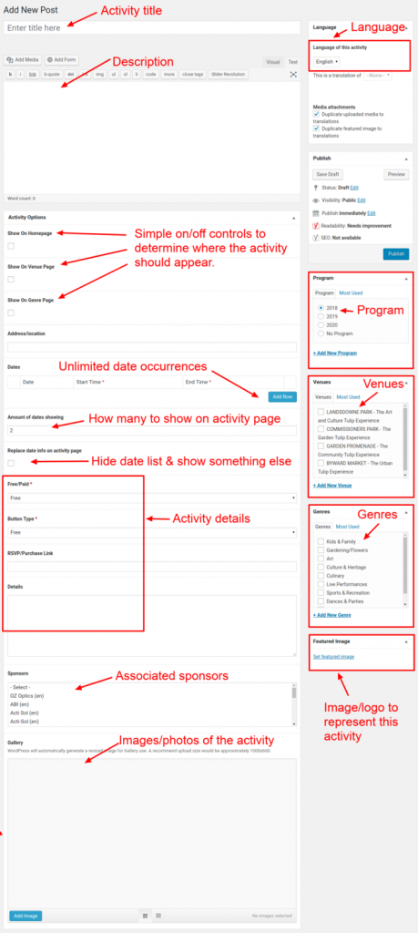
The form is long because there is a lot of information needed for each activity, but it’s all very intuitive and easy to fill in. This structure ensures consistency across all activities. Each piece of information also acts as a reminder to help the user not forget anything important.

Boost your online presence with our help
- Web design and development
- SEO and PPC
- Social media strategy
- AI technology
The team is also able to manage the activities in an organized fashion – they are not cluttered in with the list of Pages or Posts from the website; they have their own administrative section. They can also change details such as Venues, Genres, and Programs in their own lists which are set up as vocabularies.
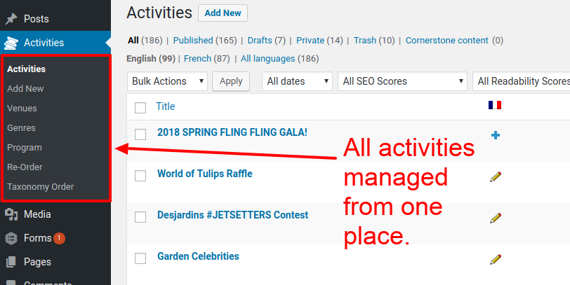
If they need to edit something or correct a typo, they just locate the item and edit it. No headaches, no hassles. One change and the entire website is updated. This is the power of structured content.
The key objective we aim for is to avoid duplication of data
A well organized website should only need you to input or update something ONCE in one place avoiding data inconsistencies and of course, saving you time.
Now, let’s look at how this impacts the front-end.
For the festival goers: the front-end experience
We worked with the Tulip Festival team to identify the ideal end-user experience.
While doing so, we identified areas where the content could be automated – meaning that the content would display based on certain rules. This is what is referred to as “dynamic content”.
Out-of-the-box, WordPress does not do a great job at this – it has be adjusted to meet your content needs. That’s why many websites suffer from content inaccuracies.
You may have run into a similar situation yourself before. For example, you might see a 5pm start time for an event on the homepage, yet that same event shows a 6pm start time on another page. That is a direct result of duplication and a lack of dynamic content. The website administrators have to update that date information in 2 places each time they change the start time. If that info was pulled from the same place each time, then they would always show the same start time.
Now, it’s not too bad if you have one event every few weeks, but what if you have 100 activities happening in a 12-day span 🙂
Here’s what we set up:
Activities
Each activity page follows a set layout, also known as a template. When activities are created, they each automatically get their own page and all the information shows up in the right places on the page. This means zero guesswork on the part of the Tulip Festival team. If the layout needs to be changed, we can change it at one place in the template and all the activity pages are adjusted instantly.
Here’s a screenshot of an activity page showing the layout; I’ve highlighted in red the various items that appear.
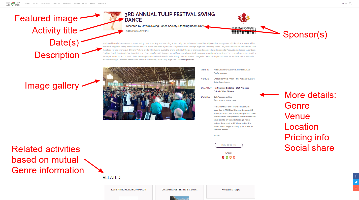
Notice that we automatically list related activities that have mutual Genre information.
The schedule
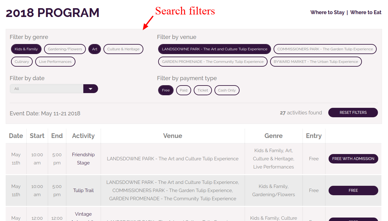
We helped identify the desired filters such as genre, venue, date, and payment type. Festival-goers would now be able to filter the busy schedule by simple options. All this information is pulled directly from the activities. If any activity gets updated, it automatically gets reflected in this schedule because this schedule is always pulling the latest versions of each activity.
List of venues
The list of venues at the top of the homepage is dynamic and pulls the info from the Venue records. If the team needs to update the title, description, or image, they can do it in the back-end of the site ONCE and it will update here and on all places across the site that show this venue.
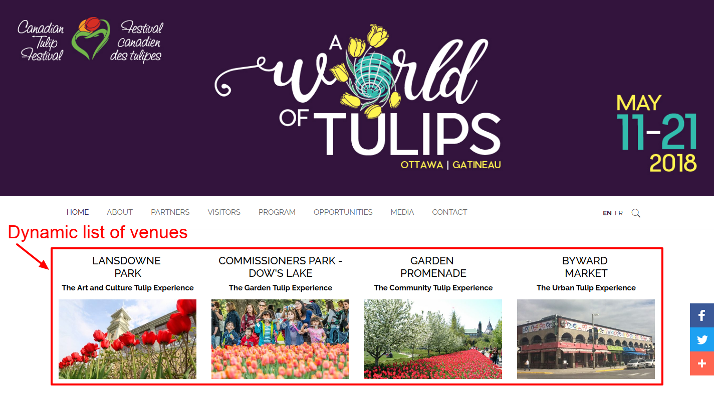
The same thing happens on the Program by Genre and Program by Venue pages.
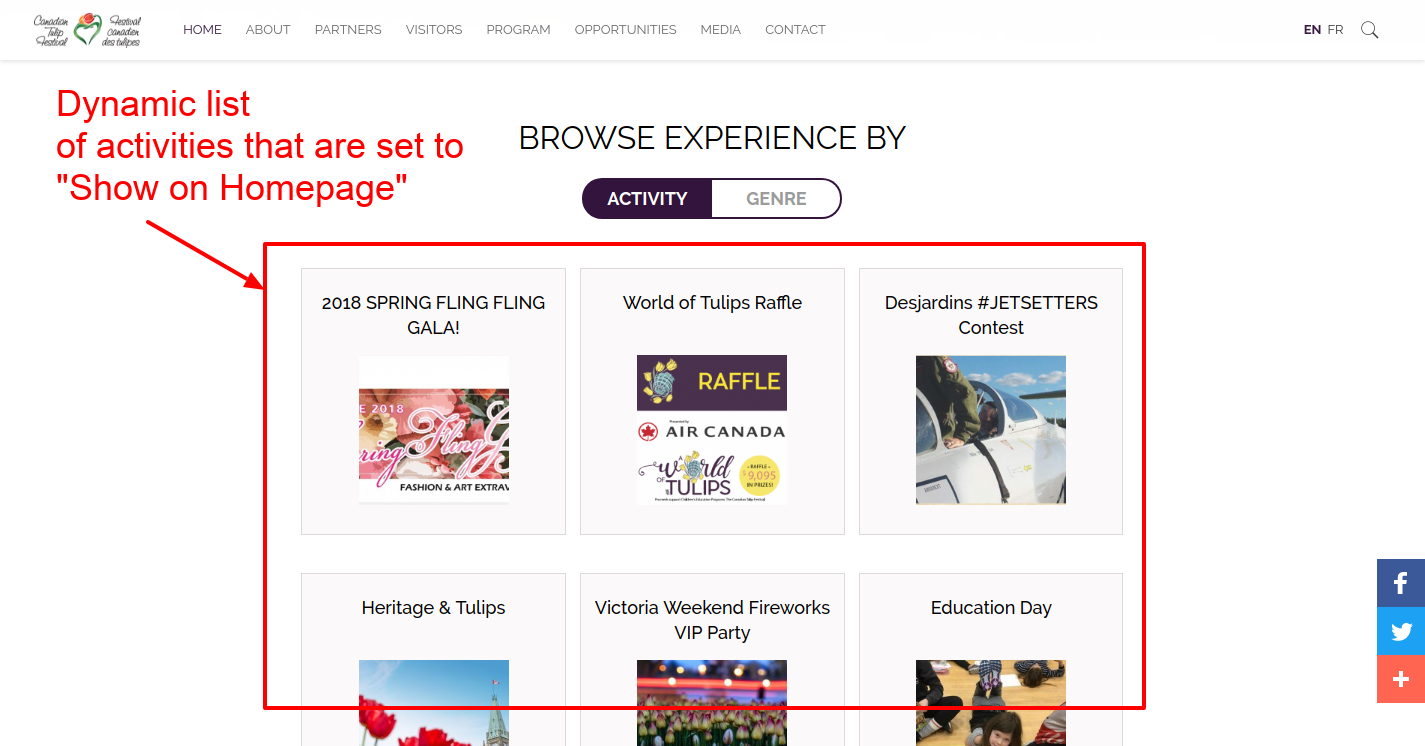
List of activities
This is a list of certain activities the team wants to highlight on the homepage. They simply check the “Show on homepage” box for the appropriate activities and genres, and they appear here.
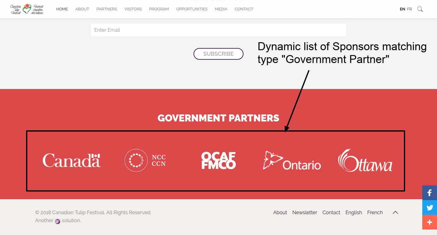
The sponsors
The sponsor links at the bottom of each page are categorized into the “Government Partner” category are listed here automatically. The same happens on the Partners page where all the logos are displayed organized by sponsor categories.
Essentially, we turned what was once a complex game of guesswork into a simple data entry exercise.
And not only for this year, but for all years going forward. In 2019, when it will be time to set up the new program, the team will be able to simply copy and edit the content items they need for the new program, un-publish the old items, and the website will adjust automatically.
This is where the true benefits of dynamic data and structured content come in handy.
Structured content and dynamic listings are the cornerstones to a successful website with custom content needs.
This type of solution can be applied to any business that has a large volume of content to publish and manage on their website. We’ve created similar content structures for an art gallery, a dance school, cinemas, sites with membership portals, and more.
If this article hits home with you and you suspect your business has unique content that could use some structure, I’d love to chat with you.
Book a free consult to discuss your goals
Swipe up for expert help!

