"*" indicates required fields
Is your website turning people away?
You’ve heard the saying, “a person’s handshake says a lot about them.”
Now think of websites as the new handshake. Though websites have been around for a long time, never before have we spent as much time surfing the web as we do now.
Virtually everything has moved online (no pun intended!) including your customers – so your business needs to adapt as well. A great way to do this is by starting with your website design.
Why should you care about your website design?
Other than it being a minimum requirement for your business in this digital age, here are some other reasons why your website design matters:
- It only takes a user 0.05 seconds to form a first impression of your business when visiting your website. Make sure it’s a good one.
- Every time someone visits a website for the first time, they develop an immediate opinion from what they see, whether they realize it or not. This only takes 50 milliseconds, so if your website isn’t designed well, then new visitors may not understand your brand for what it is.
- Though the content on your website is also important, what sticks out to visitors during that quick first glance is your website design. Additionally, if your website doesn’t look up to parr, your users may not even stick around to read your awesome content.
- Websites are an excellent marketing tool for you to communicate your brand accurately to your customers. If you leverage this tool well through an effective website design, it can be a powerful way to create online clientele and grow your brand.
Good website design presents a better user experience.
If your website is strategically designed and intrigues users to stay on it for longer than a few seconds, that’s when your website content and copywriting reels them in. This part is critical for generating leads for your business.
One example of poor user experience occurs when a website is difficult to navigate, which requires the user to “think too much.” If this is the case for your website, it can cause frustration on the user’s side and be more likely for them to visit a competitor, whose website is much easier to use.
You also don’t want to give users a “meh” experience, where they feel indifferent about your site. This could be due to a dull or outdated design that doesn’t give a lasting impression or memorable experience. Good website design matters, not only for aesthetic and branding purposes, but also for the experience you want to offer users who visit your site.
When should you redesign your website?
While it can be difficult to measure when your website needs a design refresh, U7 SOLUTIONS has been working with websites for over 7 years, and here are 4 of our tell-tale signs that it is time to consider redesigning your website.
Boost your online presence with our help
- Web design and development
- SEO and PPC
- Social media strategy
- AI technology
1. Your business services or products have significantly changed.
As your company grows, its services and products usually change as well. Maybe you’ve rebranded. Maybe you’ve created an entire new department.
Whatever it is, your website needs to always reflect important changes in your company to uphold credibility in your industry.
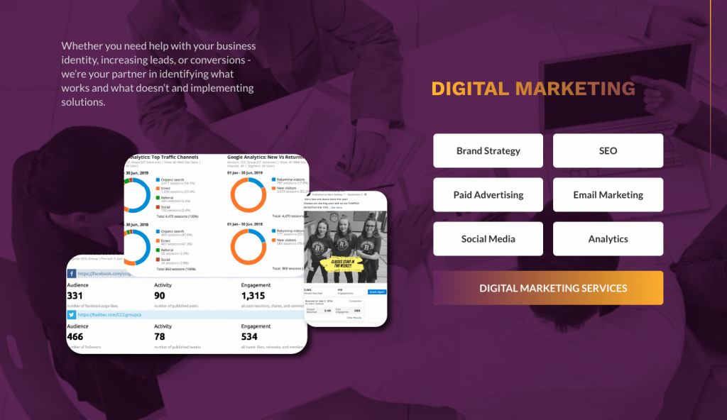
Take our company as an example. U7 has grown significantly in the past 5 years, specifically in our digital marketing team. To promote our new services to future clients, we redesigned our website to represent a team that specializes in all things marketing.
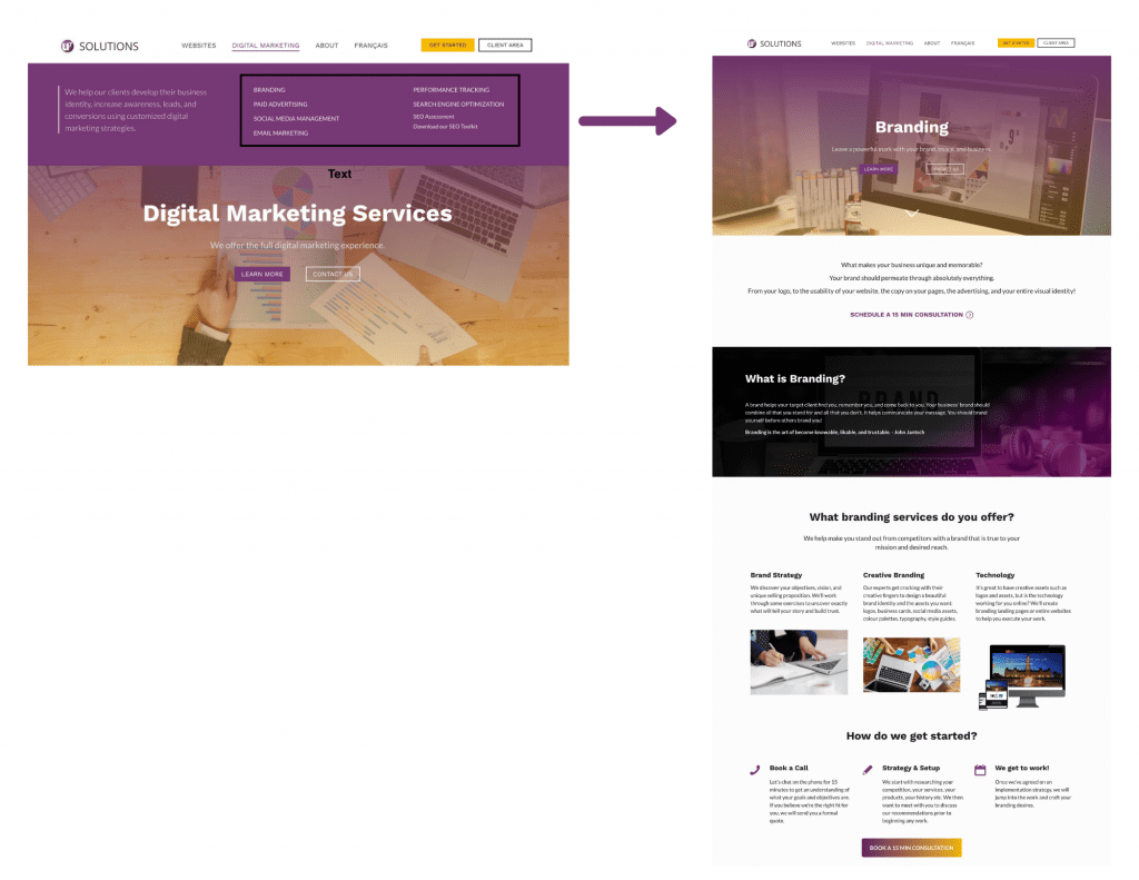
One way we did this was by creating a designated marketing section on our homepage to introduce our services:
Another method was creating a mega menu with a tab specifically for digital marketing, consisting of new pages for each service. For example, branding:
When you need to make many new changes to your website, the time you take to strategize and implement them may be more productive to do during a website redesign process.
2. Your website is not mobile-friendly
As of May 2021, around 56% of all web traffic comes from mobile phones.
This is both good and bad news: the good news is that people can access your website anywhere at any time, which makes it a lot more convenient for them to do so. The bad news is if your website is not designed responsively for mobile screens, then roughly 56% of people who visit your site will have a really poor experience.
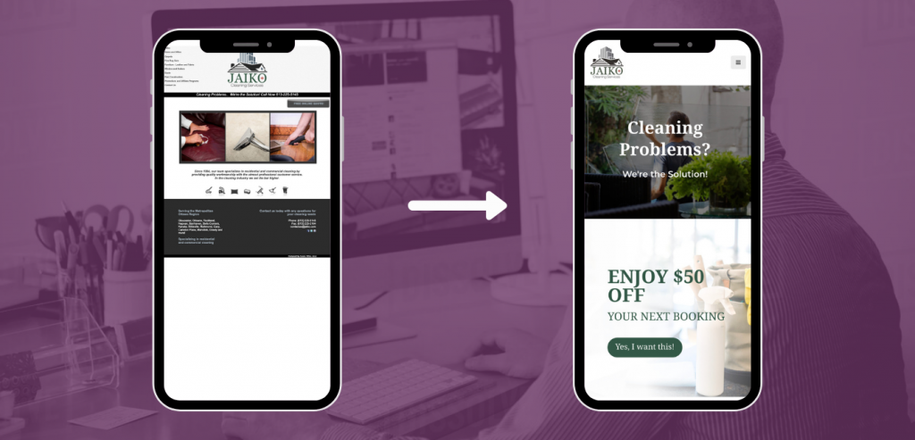
A mobile-friendly website simply means that your site looks great and works properly no matter which device the user is on. Here is an example of how U7 redesigned Jaiko’s Cleaning Services’ website to be mobile-friendly:
The phone on the left shows Jaiko’s old website, which is difficult to use on this screen size. When we redesigned the website, we ensured mobile-friendliness for small screens, as seen on the right. Now, customers can browse Jaiko’s website on their mobile screens without needing to zoom in to press a button, read text, or submit a contact form. Any information or actions they want to access on the site can now be done seamlessly on their mobile phones. We do this for all our web designs, so feel free to view our other work here.
3. Your website has a high bounce rate
The bounce rate is how often someone visits a page on your website and leaves without doing anything.
For example, multiple people clicking on a website and leaving it immediately will result in a high bounce rate for that website. On the contrary, if several people visit your website and browse a few different pages before leaving, the bounce rate decreases.
Bounce rate reveals important feedback for your website, mostly on how much (or how little) people are engaging with your content. An ideal bounce rate is in the 26-40% range, while an average bounce rate is typically 40-55%.
If your bounce rate sits around 56-70%, that means the vast majority of website visitors are NOT engaging with your content. This requires some investigation and is likely fixable with some upgrades to the website design. See what our awesome client had to say about our work on their website that contributed to a dramatic increase in conversions:
“Our collaboration with U7 resulted in a website that is converting visitors for us at about 70-80% (no joke). […] The design of the site fits our strategy perfectly, which is to create an instantaneous personal connection with and establish the bona fides of the principle of our company, Renata Brum. I don’t know if the site could be any better than it turned out and it is performing way, way beyond our expectations. I presume the savvy team at U7 will do the same stellar work for your business as they did for ours.”
– Michael Rand, Brum Immigration.
If you’re interested in tracking your website’s bounce rate, contact us to help you get set up with Google Analytics.
4. Your website was last designed over 3 years ago.
Like technology, design trends move quickly. What was considered “good design” three years ago is considered “outdated” today. Let us present another visual example to do all the talking on this one:
Typical contact form in 2016: boring!
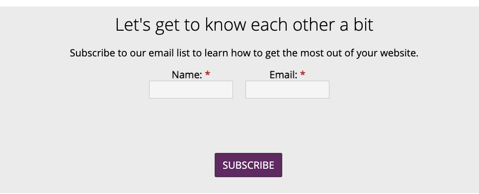
Not bad functionality-wise, but as for design…it’s not great. The ‘Subscribe’ button is not centred and there’s way too much space between the input fields and the Subscribe button. Other attributes that need an update are the use of typography, branding colours, and even the tagline!
Redesigned contact form as of 2021: creative and includes unique personal touch.

As you can see, a good estimate for when you should redesign your website could just be a matter of time!
What’s your website design story?
Every artist will always tell you their art is unfinished. Likewise, every designer and developer will tell you that websites are never really “done.”
To have a website is to have an ongoing project that regularly requires maintenance and changes to the design. Maybe all of this sounds like too much work and not something you want to spend your time on, but what if we told you that revamping your website doesn’t have to be painful?
U7 SOLUTIONS is a web design and digital marketing agency in Ottawa, Canada. For 7 years we have helped small and medium businesses thrive online with strategic websites. Contact us today for a free discovery call to get started with your website design, strategy, or digital marketing!
Book a free consult to discuss your goals
Swipe up for expert help!
